Today’s piece is mostly about bitcoin…
… but even if you don’t care about crypto you might find it makes some interesting observations on the behavior of volatility overall. And I believe it contains one of the cooler charts I’ve ever constructed.

Today’s piece is mostly about bitcoin…
… but even if you don’t care about crypto you might find it makes some interesting observations on the behavior of volatility overall. And I believe it contains one of the cooler charts I’ve ever constructed.

Larger version at end
Long 19JAN24 0.6650 AUD put
for ~25bps off 0.6700 spot
Long EURSEK @ 11.26
Stop loss 11.1440
January 16, 2024
Here’s reason #427 the soft data doesn’t work anymore. More strong evidence of accelerating negativity bias. A brand-new paper tells you what you probably already knew, using an insanely copious data set to do so.
Abstract:
Using text from 200 million pages of 13,000 US local newspapers and machine learning methods, we construct a 170-year-long measure of economic sentiment at the country and state levels, that expands existing measures in both the time series (by more than a century) and the cross-section. Our measure predicts GDP (both nationally and locally), consumption, and employment growth, even after controlling for commonly-used predictors, as well as monetary policy decisions. Our measure is distinct from the information in expert forecasts and leads its consensus value. Interestingly, news coverage has become increasingly negative across all states in the past half-century.
The key charts:
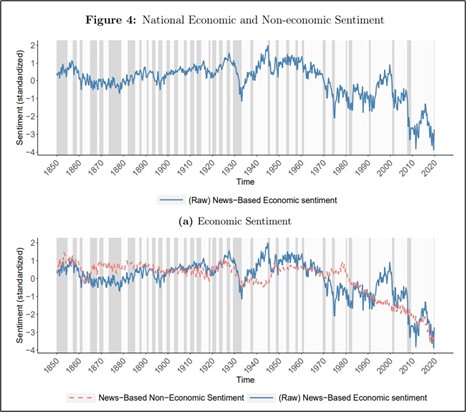
https://www.nber.org/system/files/working_papers/w32026/w32026.pdf
Regardless of how individuals and companies feel about their own prospects, social media, MSM, and political strife make everyone think that everything is bad, all the time. It’s not just the low-quality, biased information that dominates the media ecosystem now due to warped incentives, it’s the sheer volume of it. This started in 2008 and got worse after 2020.
Soft data may have some minor utility on a relative basis (comparing 2022 to 2023, for example) but saying “ISM is below 50, ruh roh” probably doesn’t work anymore. Everything needs to be rescaled lower to recalibrate for persistent malaise. Empire State -43.7 lol. I am not dissing the unease people feel; I feel it too. I’m just saying that soft economic data doesn’t work as well in this regime as it does in a regime where the American spirit is healthy. Sentiment and the nominal economy have decoupled and there is no guarantee they will recouple anytime soon.
Even if you don’t care about bitcoin, you might find this section interesting because it has broader applicability to financial market vol and individual security volatility.
Here’s my base case of how BTC plays out post ETF launch: The buy rumor / sell fact trade is in progress. Leveraged longs hope 40k will hold and they hope big money comes in on the bid for the ETFs today or sometime soon. Today’s 9:30 a.m. NY stock market open will be interesting for BTC and BITI. Will there be demand?
My guess is that there will not be enough demand in the short-term. Sophisticated individual investors are already long GBTC MSTR and other stuff like MARA and are flipping out of those securities into BITI. Some marginal demand for spot BTC is generated here but not enough.
Pension funds and sovereign wealth funds look on with interest, but they need a lotta meetings and sign offs before they can pull the trigger. They hated GBTC because of the random discount / premium factor and poor liquidity, and they hated BITO because of the negative carry / rolldown. They like IBIT because it’s not a proxy and it’s cheap to hold. But they are slow moving.
This creates a baton pass problem as there is not enough immediate marginal buying for all the exit liquidity spec longs need. We break 40k and some big stop outs and liquidations happen. Things stabilize 33500/35500 as strong hands appear.
Bitcoin hourly back to pre-ETF rip higher
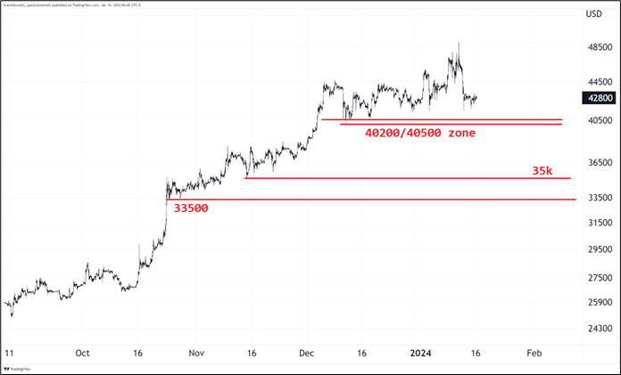
Eventually, in weeks or months ahead, a pension fund or SWF announces a huge buy and that opens the door for others to follow. Career risk will shift from “I better avoid this stuff” to “I’m gonna be behind benchmark if I don’t put on 2 percent of AUM”. That first headline from Calpers, or Ontario Teachers, or ADIA, or whoever will be a watershed moment, when it comes.
So in summary … 49k to 42k – you are here – 35k/36k – 65k. And some tiny chance of crazy topside convexity after that à la short squeeze if too many pensions get interested at once now that Blackrock has given the stamp of approval and liquidity they need. Best strategy I think is wait for 36k and then sell put spreads to buy calls.
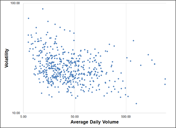
I also expect that the huge increase in liquidity and volume brought on by the new ETFs will lead to lower volatility over time. This is a logical, nearly-inevitable evolution as a newborn security with a wildly uncertain value and price matures into a mainstream asset with a million punters punting. I was pretty sure that volatility should be negatively correlated with both volumes traded and market cap, but just to make sure, I took a look. The relationships are visible and logical but they are not laws of physics.
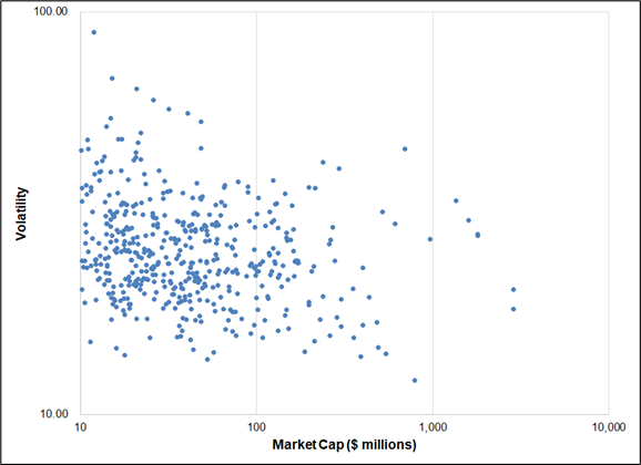
For example, here is a scatterplot of S&P 500 constituents by market cap and volatility. All the volatility scatterplots that follow use log for both the x- and y-axis. Low volume = higher vol but there’s a ton of variance.
S&P 500 constituents, ADV vs. 90-day volatility
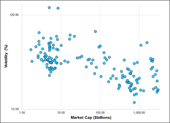
Similarly, one might expect that a larger market cap leads to less volatility. This is because trees do not grow to the sky. It’s easy for a 3-cent stock to go to three bucks but it’s hard for a 3 trillion USD company to go to 300 trillion. The global economy is a certain size and as things become gigantic, their ability to grow (and thus their volatility) falls. Again, you see the low market caps often have higher vol, but not always.
S&P 500 constituents, Market Cap vs. 90-day volatility
Finally, I ran this for the history of Apple stock because that’s a company that has varied in size substantially over the decades and went from tiny to gigantic. Same deal.
Apple, Market Cap vs. 90-day volatility, 1988 to now
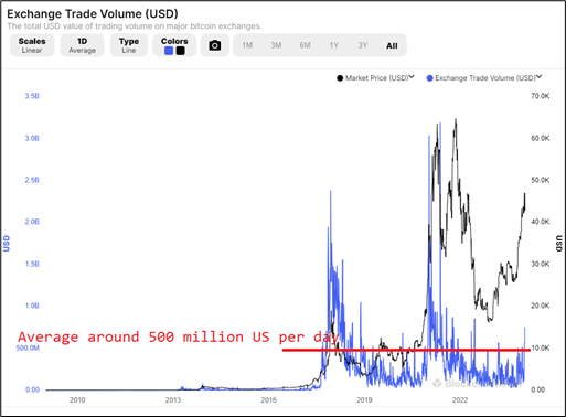
We don’t know how bitcoin volumes are going to progress from here, but here are some stats for comparison. The blue line in this chart uses the left y-axis and shows average daily volume of about $500m on crypto exchanges (with substantial variability).
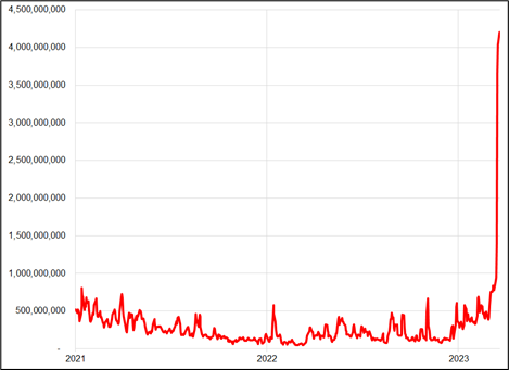
And here’s ETF volumes last week (total). These will obviously come down substantially, but you can see the initial surge dwarfed crypto exchange volumes. I would assume even as things normalize, NYSE dollar value traded of bitcoin will be larger than what goes through on the blockchain.
USD value of BITO, IBIT, and GBTC trades, 3-day moving average
So we will get higher volumes, and we have a high market cap. Here’s the relationship between market cap and volatility for bitcoin’s history.
Bitcoin market cap vs. volatility, 2010 to now
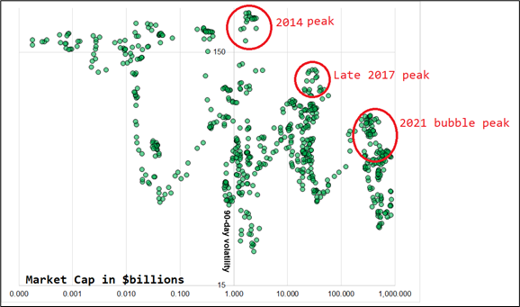
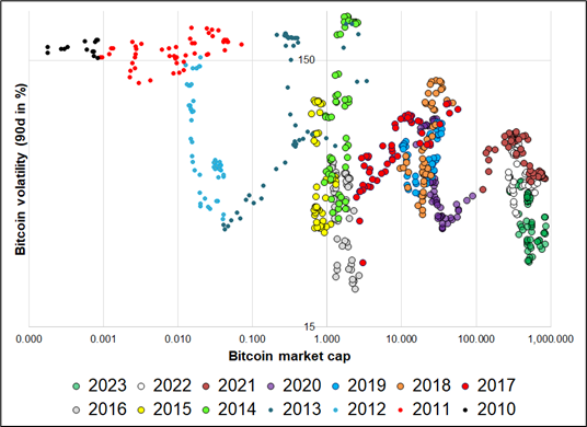
Each mania / peak delivers a lower high in volatility, as you would predict. For fun, I laid out the same data with each year colored so you can see the evolution. It’s cool to see how it regime switches from euphoria to winter again and again. Because of the log y-axis, you can’t see the y-axis labels very well. Currently, we are trading 30/40 vol. I used 90-day % realized volatility from Bloomberg for all the charts today.
Bitcoin market cap vs. volatility, 2010 to now
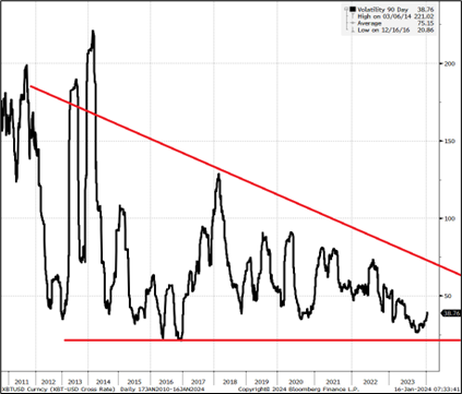
And finally, here’s the vol on its own. You can see the peaks get lower and there is a floor around 20.
Bitcoin volatility, 2011 to now
Excellent interview with Villeroy here. He explains his reaction function very clearly. Importantly, he says that he sees r-star around 0% which implies ECB rates are probably too high, soon. In contrast to many commentators, he does not think the last mile is different on inflation reduction.

*VILLEROY: WE ESTIMATE R* TO BE AROUND ZERO IN EURO AREA
That headline is interesting given the ECB rate is 4% and inflation is already somewhere down around 3% and falling.
On the other side of the Channel, we get UK inflation tomorrow and the BRC number, which has decent correlation to the official data, ticked up significantly in December. As such, I think the risks are skewed a bit towards a strong UK CPI tomorrow, especially as yesterday Bailey said:
“We are concerned about the potential persistence of inflation as we go through the remainder of the journey down to 2%, and I think the market is underestimating that.”
If you look back to 2018, the median and average of the monthly release for UK CPI has been a bit higher than the BRC data and yet the BRC MoM for December was 0.4% and the Bloomberg median estimate for UK CPI tomorrow is 0.2%. The relationship is solid overall, but noisy month-to-month so I would rate this a 3-out-of-5 star signal. Same data served two ways:
BRC MoM Inflation vs. UK CPI MoM
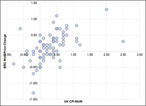
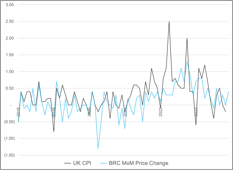
Tickers are UKRPCJMR and BRCPALLM
I’m not doing it because of the GBP long positioning set up (see positioning report right after this) but short EURGBP with a tight stop like 0.8656 probably works over the next 24 hours. Also, if you’re worried about what looks like worrisome escalation in the Middle East, probably time to get short EURCHF.
Have a snowy day.
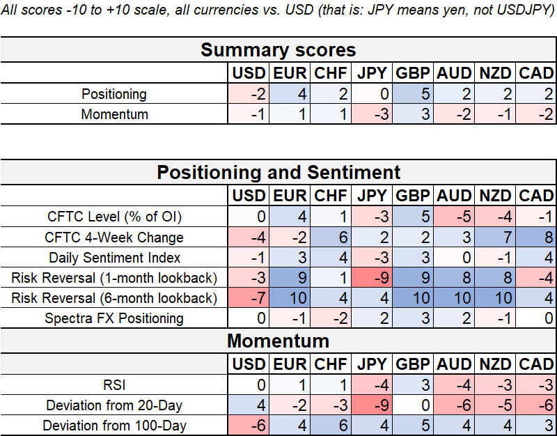
The Spectra FX Positioning and Momentum Report
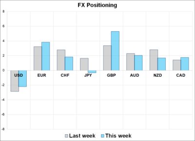
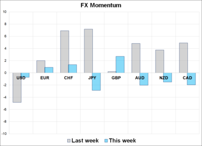
Hi. Welcome to this week’s report. FX momentum has stabilized as we range trade with a higher USD bias. 2024 has been a mini version of 2023 with the USD strong, JPY weak, MXN and carry in vogue, and AUD bringing frustration and sadness to longs. Participation has been low so far this year as there is no clear theme other than carry continuing its wild rumpus.
Two Observations
1. The notable shifts from the last report are in momentum because I missed a week while I was travelling and in the last two weeks, we have gone from medium downward USD momentum into year end to medium upward USD momentum this year. CHF and JPY are notable flippers as the market was lifting those currencies with both hands as 2023 drew to a close and has been selling them both hands since.
2. GBP positioning stands out as it has traded immune to USD strength so far this year, but the risk now is that the flurry of UK data this week disappoints and the bottom falls out.
If you scan the column marked GBP on the next page, you will see that every single metric is blue (positive) as the options market is particularly sanguine on Betty’s outlook.
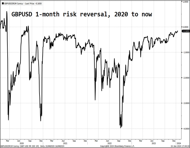
I looked at prior times when the 1-month risk reversal went above minus 0.2 and the next chart shows 20-day forward returns. The sample size is too small to get wildly excited, but most positioning backtests tend to show GBP is a good contrarian play and this backtest agrees. This is the first time since late 2020 that the risk reversal has been above minus 0.2.
GBPUSD 20-day performance after the 1-month risky goes above -0.2
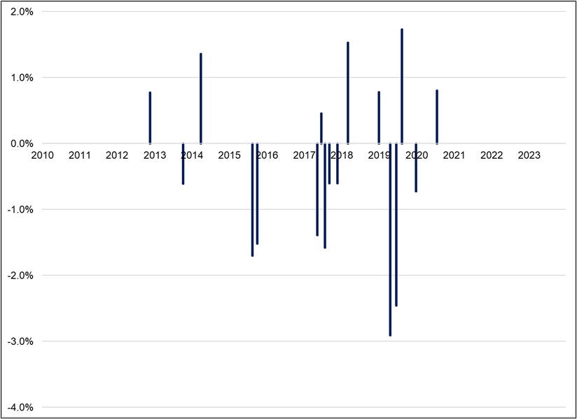
Sample is 17 events, 10 down, 7 up with an average return of -0.4%. This is especially interesting in the context of a big data week coming up for the UK. Caution is warranted in cable.
—
G10 FX Positioning and Momentum Scores
That’s this week’s report. Thank you for reading.