October 25, 2022
Housing and Cycles
I have run across a variety of compelling charts that show housing leads the labor market (for example from Michael Kanro here, and Macro Alf here). This idea makes sense. Housing is interest rate sensitive, high beta, early mover. The charts I have seen mostly use the US Unemployment Rate (UR) as a measure of the jobs market. Thing is, Initial Claims always lead the Unemployment Rate at cycle turns, as you can see here.
US Initial Claims vs. US Unemployment Rate
Marked with Initial Claims lead vs. UR at each turn
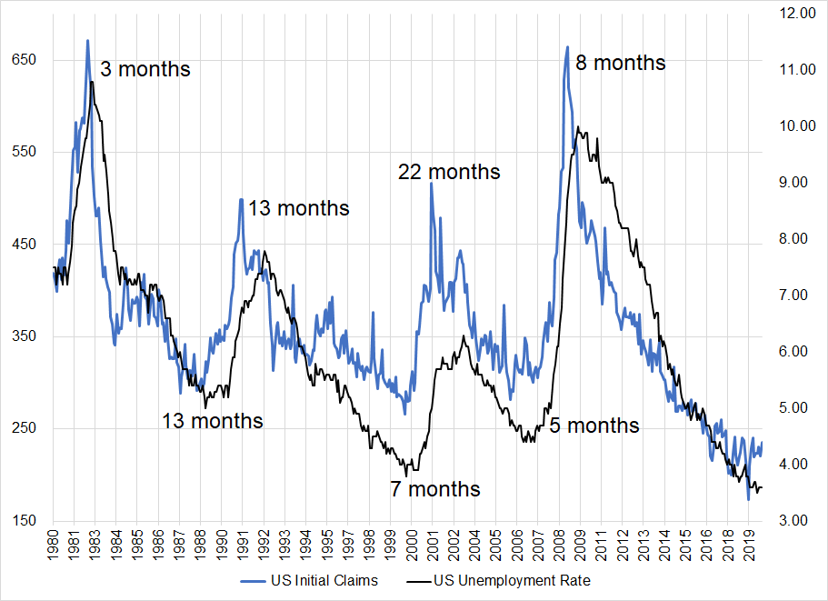
Left y-axis is US Jobless Claims, right y-axis is US Unemployment Rate (U3)
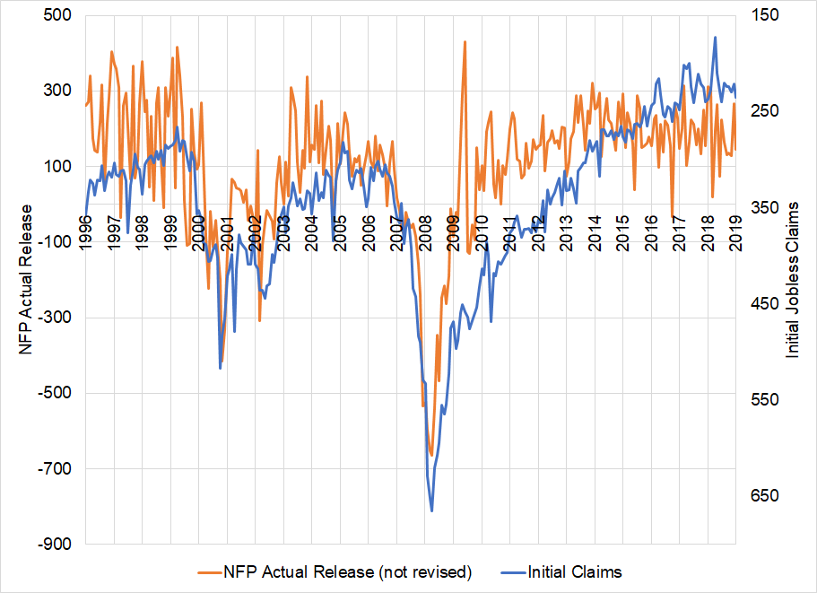
And while NFP is coincident with Initial Claims, you can see in the next chart it’s considerably noisier to the point where its incremental utility is close to zero. Initial Claims are timelier, less noisy, and less subject to revision. It remains a mystery to me why NFP day is such a big market mover when it’s 50% lagging, 40% noise, and 10% signal. But hey… It doesn’t always have to make sense. The household survey is even noisier and analysis that uses three or four months of household survey data to draw conclusions about the US labor market should be discounted. Here’s Claims vs. NFP:
US Initial Claims vs. US Nonfarm Payrolls
Even if you smooth NFP using a 3-month average, you get this:
US Initial Claims vs. 3-month average of US Nonfarm Payrolls
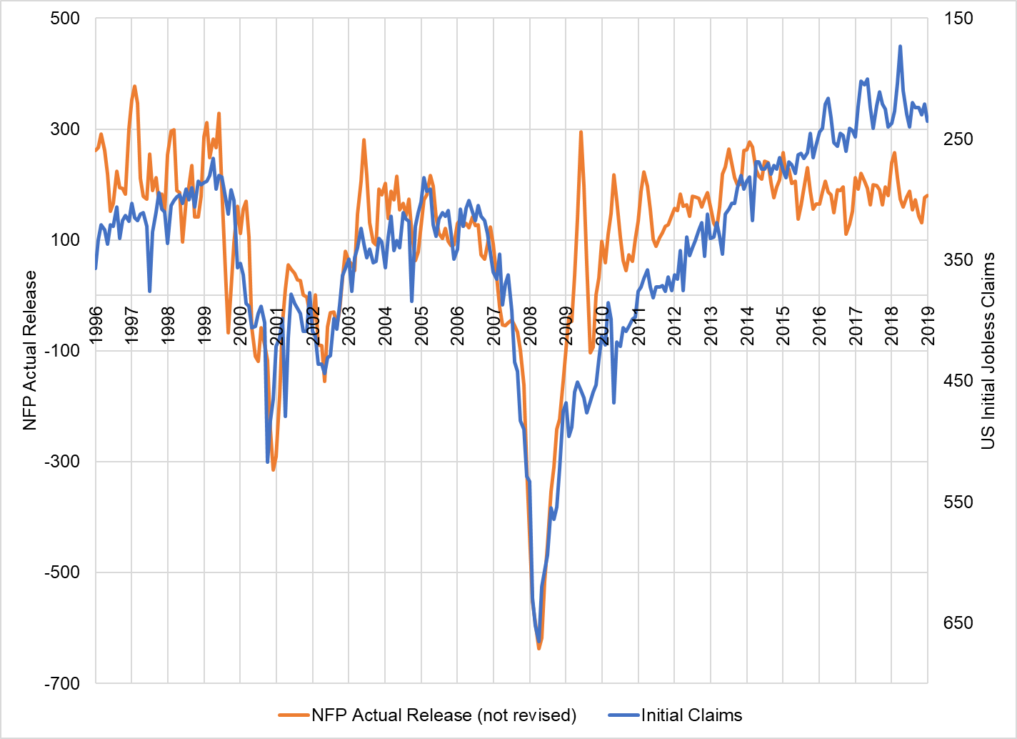
Charts show 1996 to 2019.
I left out 2020- because COVID blows up the y-axis and there is no useful information in that data.
But obviously a 3-month smoothed series of monthly data is not going to be as timely as the raw weekly data you get from Initial Claims. This is why I think the labor market vs. housing chart is more informative if you plot NAHB vs. Initial Claims. So here you go:
US Initial Claims vs. NAHB Housing Index
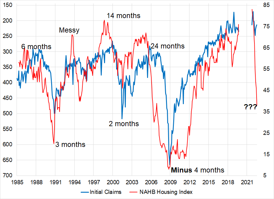
Left y-axis is US Jobless Claims (inverted), right y-axis is NAHB Housing Index
I have labelled the lags between housing and claims, and you can see that NAHB usually leads the turn when the economy heads down. In the recovery part of the cycle, they are more coincident. NAHB peaked in November 2020 and started to collapse in early 2022. Prior lags between housing and the labor market were 6 to 24 months, but the abnormally long lag in 2006 is probably not going to happen again given that was a housing bubble that played out slowly and gradually over years and the 2021 all-you-can-eat housing binge is a spike and reverse that is unwinding as quickly as it boomed.
My question for you is: Can you think of any reason why this time will be different? Housing’s contribution to the US economy is back to its 1980 – 2006 average:
Housing Share of GDP, 1980 to now (USA)
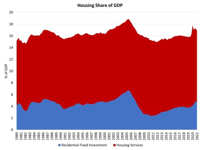
So, housing influences around 16%/18% of GDP with 4.7% directly attributable to residential fixed investment. For context, here’s how the US stacks up against past and current housing wildness:
Residential Investment as a % of GDP in USA, Canada, Ireland and Spain, 1985 to now
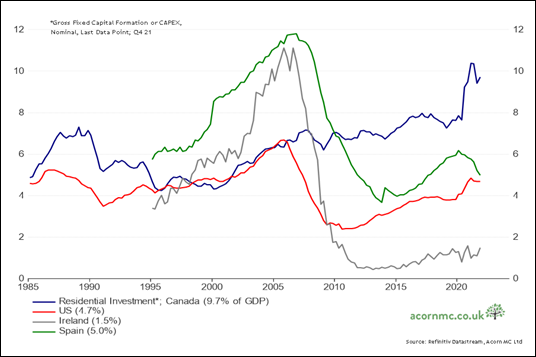
https://twitter.com/RichardDias_CFA/status/1509665264362827780?s=20&t=B4ImbDvlqPQJPkpL7TFzlQ
The Tweeter of that chart points out: “Canada’s Residential Investment (as a share of GDP) is flirting with the highs we saw in Ireland & Spain during their housing bubbles… and right before they popped.”
The Canadian Housing Crash is the boogeyman under the bed every year but as you know if you have seen the movie Halloween: Sometimes boogeymen are real[1].
On the topic of Canadian housing as an evergreen doom and gloom narrative, the Maclean’s cover below is a true classic.

The online version featured this pic:

Flames!
But just because a narrative has been persistently wrong, over and over, does not mean it will be wrong forever.
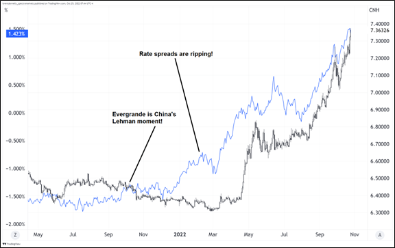
I remember from the day I started at Spectra in September 2021 and right through the start of 2022, it looked obvious that USDCNH should be going higher. Everyone was trying various approaches, but the thing wouldn’t budge. Then, months later, it finally went. Yes, CNH is a managed currency, so that could explain that particular lag, but this is emblematic of how sometimes markets just don’t do what you think they should do for ages—then they do it with a vengeance.
USDCNH vs. US / China 10-year rate differential
“People have tried this many times and it never worked before” is not a good reason to exclude a thesis, though it is a reason to look for triggers and signals before getting involved. Then again, the JGB trade has been coiling for years and never goes. Timing is hard. In trading, early is a synonym for wrong.
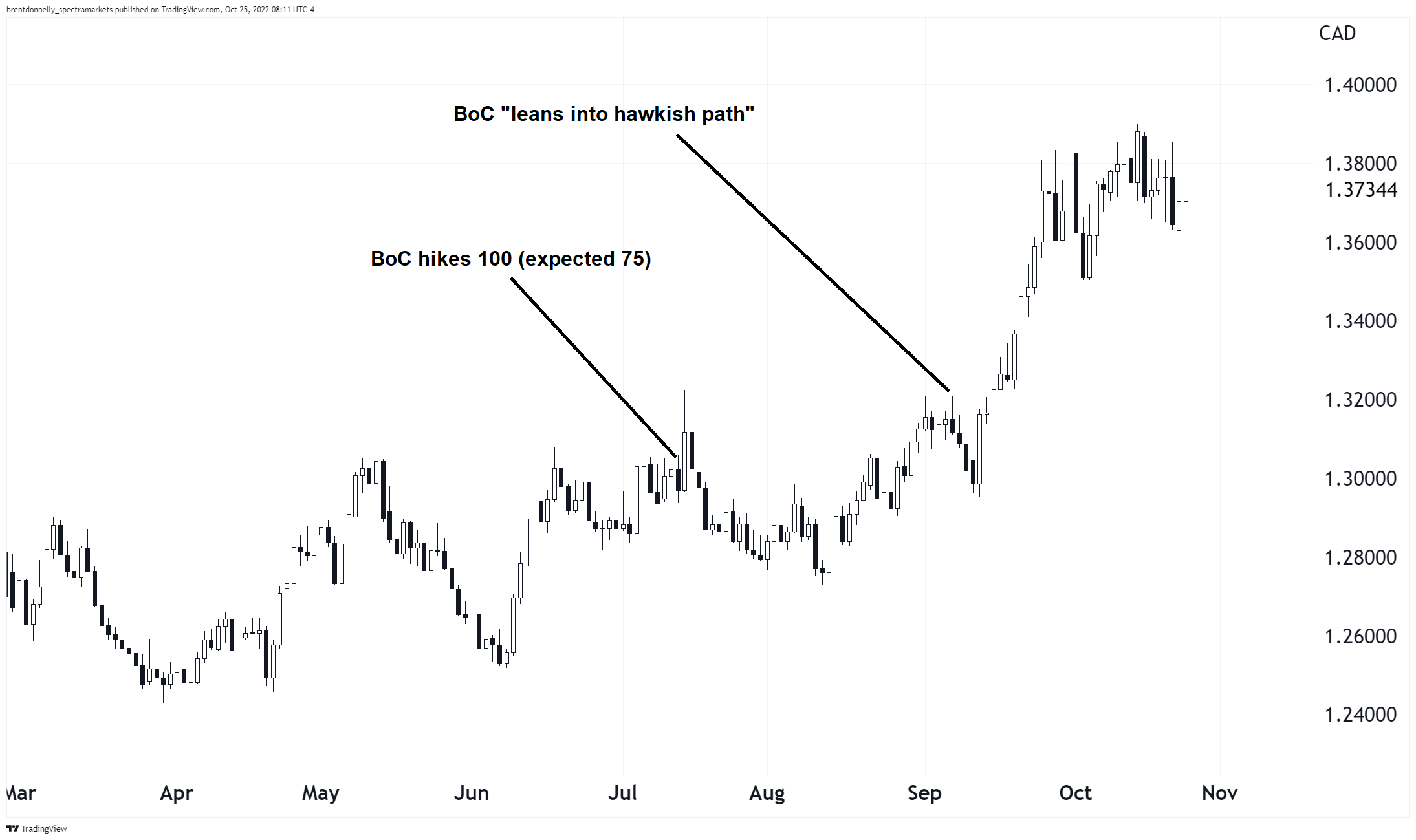
If you believe that the Canadian economy is likely to be harder hit by mortgage resets, falling residential real estate investment, and a decline in spending on housing services, I think the trade will be in rates, not CAD. This is because CAD has been driven by risky assets and US yields, not domestic news. Hawkish BoC didn’t matter for USDCAD so I’m not sure that it will matter for CAD if they turn dovish, either.
USDCAD has been driven by the US story, not the Canadian story
So, the trade is either to play a continuation of the widening of US vs. Canada rate differentials (the safer, easier bet) or play a reversal in Canadian yields. The outright yield bet is much more difficult because again, Canadian yields are driven mostly by global factors. To play the relative yield, you can sell 2y fwds (for example) or do any one of many options receiving Canada and paying USA from 1y out to 5y.
One strategy employed by some successful hedge funds is to hold a macro view, but then wait for the techs to support it before taking action. The strategy worked well in the USDCNH and helped some funds avoid the decay of entering the trade over and over again until it finally worked.
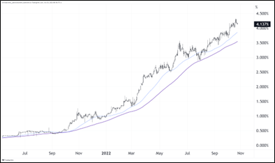
When you wait for a tech trigger, you miss the exact turn, but you enter the trade when momentum is on your side, instead of trying to fade the extremes. Here’s Canadian 2-year yields with the two moving averages that have defined the fast and slow trend. Yields are so far away from the MAs, there is not going to be a signal there anytime soon, but this is something to watch. If there is a major crapout in the Canadian economy caused by housing, the drop in yields could be fast and hard.
Canada 2-year yield, July 2021 to now (with 40-day and 80-day moving averages)
The Bank of Canada meets tomorrow, and that could be a dovish catalyst, but I have no reason to believe it will be. I am writing this with the big picture in mind, and not specifically because of tomorrow’s BoC meeting. The takeaways here are:
- If you think global yields have peaked, receiving Canada is particularly attractive.
- If you’re not sure about global yields, receiving Canada and paying USA (2-year) makes sense.
- CAD is not a good proxy for Bank of Canada policy or views on the Canadian economy.
- If you are patient, wait for Canada 2-year yields to break the 80-day moving average and then get busy.
[1] I am assuming the Halloween movie series is based on a true story about a real person named Michael Myers. Maybe that’s wrong?
Final thoughts
Every morning of every trading day since 2004 or so, I print out a daily sheet and write down my plan, thoughts, ideas, and results. Recently, I realized this would be much more efficient if I had a book preloaded with each day. That way, I could also have all the important events like seasonality, central bank meetings, holidays, and coaching / inspiration sprinkled throughout. Also, I would have a permanent record of my thoughts that I could accumulate year after year with each completed book added to my bookshelf at the end of the year.
Then, I thought other people would value such a book as well. So, with JR’s help[2], I made it. The book was put together with active traders in mind, but investors will find it useful too.
The book just came out! Literally just published about 10 minutes ago. You can grab one here:
The 2023 Spectra Markets Trader Handbook and Almanac.
Have a directional day.
P.S., my brother designed the cover. I think he did an excellent job! Thanks Steve.

good luck ⇅ be nimble
[2] i.e., JR did all the work.