All the technical setups and formations that I use and believe in reflect, in some way, the underlying structure of the market.

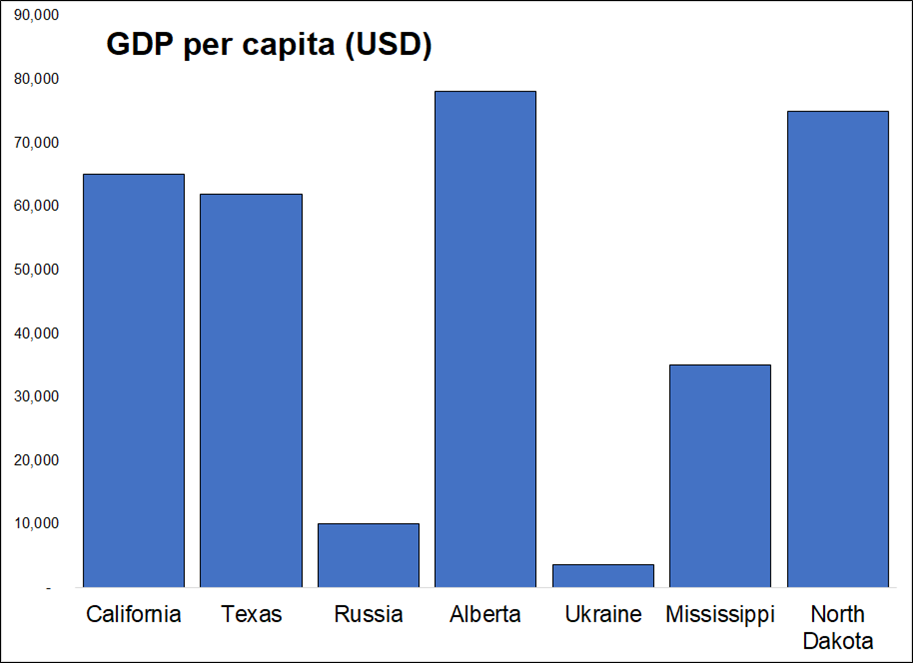
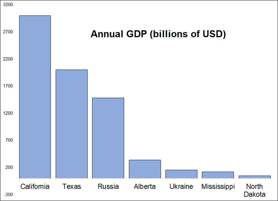
Which has a larger annual GDP? Texas or Russia?

All the technical setups and formations that I use and believe in reflect, in some way, the underlying structure of the market.

Which has a larger annual GDP? Texas or Russia?
Stop loss 0.6614
Stop loss 31400
Take profit 43900
Stop loss 1.7415
Take profit 1.7010
Long 18MAR 0.8550 EURGBP digital call at 24% (spot ref. 0.8426)
Sometimes I am blown away by the fact that I can still have new thoughts about trading after so many years. You would think that at some point… you just know what you know… after living and breathing trading and macro for 25 years… There must be nothing left to learn and no epiphanies remaining to be a-ha’d at some point right? Wrong! I still learn new stuff and my thinking on trading evolves all the time. It’s amazing.
Anyway, while writing an educational Substack on technical analysis last week, I came to an interesting realization: All the technical setups and formations that I use and believe in reflect, in some way, the underlying structure of the market. Those approaches do not reveal something about the behind-the-scenes activity happening on trading floors. That’s probably why those setups and formations appeal to me, but I never realized it until last week.
Conversely, this also explains the common feature of styles and approaches to technical analysis that do not appeal to me. They don’t match a real thing that happens in the market IRL. A highly complex and mathematical approach that operates at 15,000 feet and does not directly mirror underlying trading activity will never appeal to me.
Perhaps subconsciously I have concluded that this feature of some approaches and not others is the difference between technical analysis as “study of underlying market structure” vs. technical analysis as pig entrail reading/astrology. Some of this content overlaps with my Substack—I rarely if ever do this—but I think in this case the information is relevant for both audiences so I figured what the heck.
Slingshot reversal
This setup, which I named in 2007 but then found out later was identified much earlier by many more famous analysts than me and called something else, is a good example of how techs can mirror what’s happening on the trading floor. You can read the full description of the setup here. Fun fact: that article appeared in the physical magazine called Technical Analysis of Stocks and Commodities, a publication made of paper from trees that was quite popular back in the olden days.
Slingshot Reversal in brief (please read article for full explanation):
In real life, here’s what’s happening:
When a slingshot reversal happens, you can hear the screams of the newly-added shorts from a mile away.
Support and resistance
I have always preferred horizontal lines and simple support and resistance to trendlines, channels, arcs, Gann fans, and so on. The reason is simple. There’s very often a reason horizontal lines work: They are reflecting the reality of large bids and offers in the market.
Let’s say a Japanese auto exporter needs to sell 5 billion USDJPY, and they have left an order with a bank to sell at 116.33. They are patient and don’t mind waiting. You might get a chart that looks like this one.
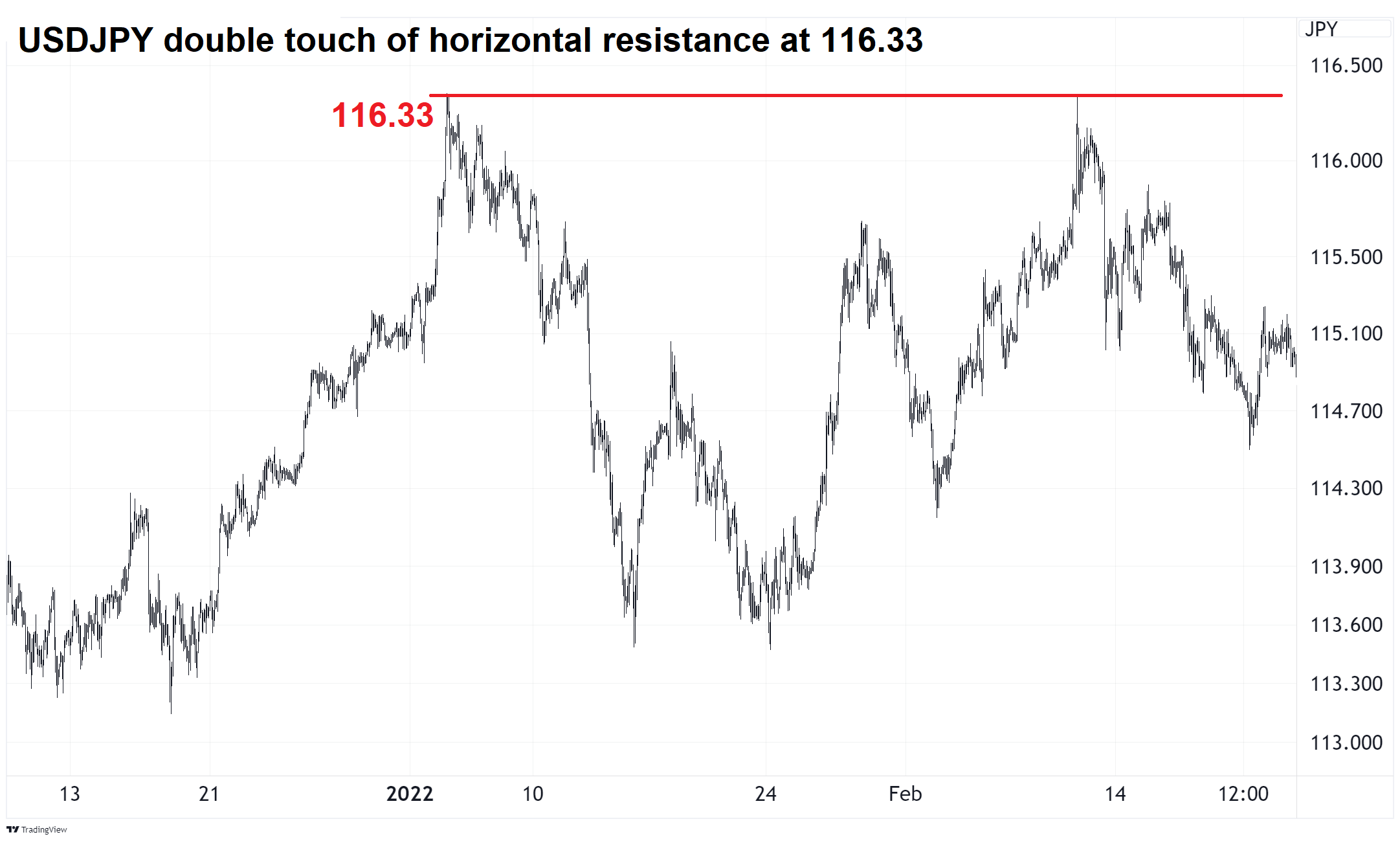
Orders related to option hedging, barriers, and central banks also offer support and resistance and often explain why a price keeps bouncing off the same level.
Volume spike at price extreme
For the first 10 or maybe 15 years of my career, I never looked at volumes. When you work in interbank foreign exchange, volumes don’t tend to feature prominently in the conversation as everyone is focused on price and (to a lesser extent) on correlated variables and drivers. Volume data is hard to come by in FX (or, it used to be) and so people just lived without it, mostly.
Then, I found out you can get EBS and Reuters volume on Eikon and so I started factoring it into my analysis. If you don’t have these services, you can use futures volume or related ETF volume. I find volume analysis works similar to sentiment and positioning analysis. It’s useless most of the time, and amazingly useful at the extremes.
My approach is simple. When there is a massive spike in volume, I attach much added importance to that level/zone. Here’s an example from my book.
Bottom pane shows EURNOK volume
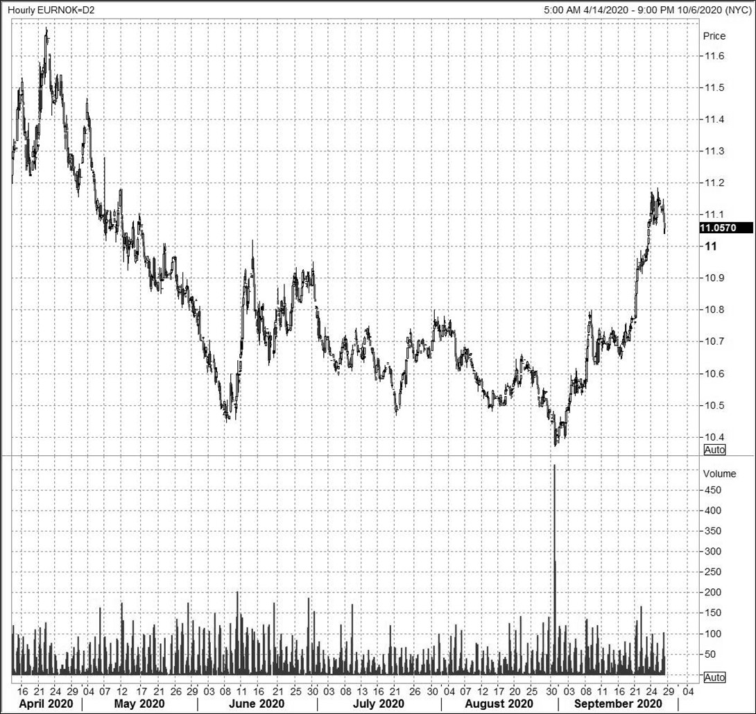
Since price is just the outcome of a whole bunch of little auctions happening every nanosecond, huge volumes identify areas where many, many auctions were held and a strong equilibrium price was either accepted or rejected. In the case of the EURNOK selling on the prior page, there was a massive month-end seller. That seller kept pushing price lower and lower until they found a big enough buyer. At that point, volumes exploded, the seller burnt out, the buyer remained, and that level became a significant reference point for EURNOK. We never traded down there again.
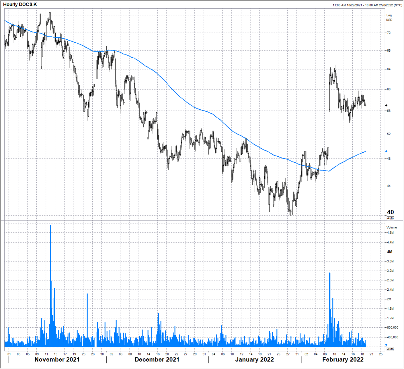
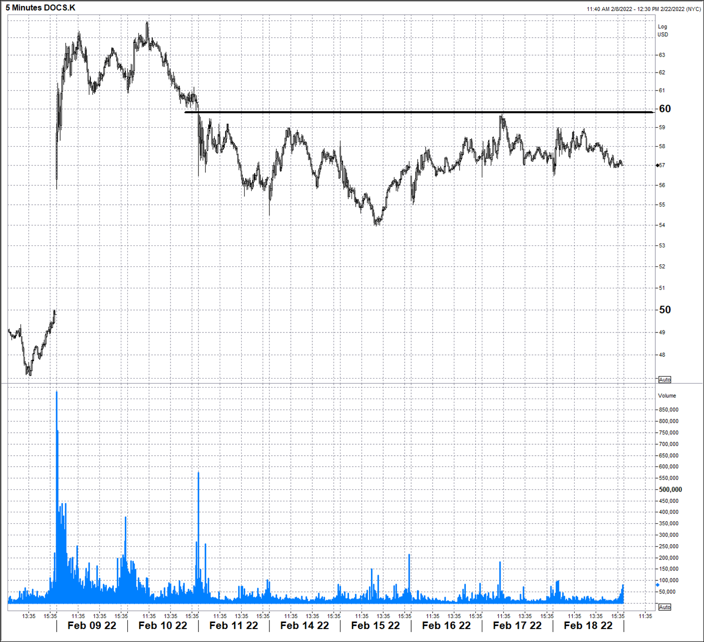
Watch for and identify high-volume areas and use those as pivots. In my short Doximity (ticker: DOCS) idea from the Substack, I showed the two charts below. The first one shows a massive volume spike that marked the ding dong high in November and the second shows two subsequent volume spikes. The first marks the earnings day spike and the second marks the first stop loss run (weak hands selling) after earnings. The breakdown through $60 on unusual volume correctly identified the $60 level as a significant reference point (and overhead horizontal resistance) going forward.
Those are approaches that I like. Now, some approaches I do not like.
Extremely complicated and subjective approaches like Elliott Wave do not appeal to me. I subscribed to a famous Elliott Wave guy from 2010 to 2013 and he was bearish stocks the whole way up. That spoiled Elliot Wave for me and revealed that extremely complex approaches are rife with confirmation bias. If there are 5 or 11 or 26 different wave counts possible on every chart, the guy who is subconsciously bearish stocks because of a personal filter that sees all news as bad news is going to find the bearish wave counts on the SPX chart every time.
Trendlines and channels. There is some reality to trendlines and channels because they reflect standard volatility and slopes of increase and decrease. That said, they are unreliable and can be subjective or objective, depending on how quanty you are or how fat your crayon is.
On very short time frames (5-minute chart), trendlines are sometimes useful because they can reveal the exact slope of a TWAP as it performs its magic in the market. When a sweet trendline on a 5-minute chart breaks, that often means the TWAP is done. I have seen this many times in real-time, in real life.
If you are a new subscriber who reads 50in50 and are worried there is overlap between am/FX and that Substack—don’t worry! I have never done this before and will probably not do it again. Have a grossly productive day.
And so I don’t anger my Albertan readers…