No obvious macro trade emerges. Yields tend to go lower, gold tends to go higher, and FX is a bit of a mess.

This is the graph of the function:
x² + ( y — ³√(x²))² =1
No obvious macro trade emerges. Yields tend to go lower, gold tends to go higher, and FX is a bit of a mess.


This is the graph of the function:
x² + ( y — ³√(x²))² =1
Flat
It is rare to go into a Fed meeting without near total certainty as to what is going to happen. Jim Bianco wrote a nice piece explaining this and again raises the question: What is the point of the Fed blackout if it can be circumvented by leaks to the press? Favoring a specific journalist or news outlet is one concern, and the obvious babying of markets for no reason is another. You get the volatility a few days before or you get it on decision day. Fed credibility would be much higher if they stopped doing this.
Anyhoo! Here we are, waiting for another leak to confirm that 50bps will be the opening salvo from the Fed. Or not. The momentum and NickyLeaks arguments for a 50bp cut dominate now, but it is worth remembering Powell’s words in 2018:
Finally, the literature on structural uncertainty suggests some broader insights. This literature started with the work of William Brainard and the well-known Brainard principle, which recommends that when you are uncertain about the effects of your actions, you should move conservatively. In other words, when unsure of the potency of a medicine, start with a somewhat smaller dose. As Brainard made clear, this is not a universal truth, and recent research highlights two particularly important cases in which doing too little comes with higher costs than doing too much.
The first case is when attempting to avoid severely adverse events such as a financial crisis or an extended period with interest rates at the effective lower bound… The second case is when inflation expectations threaten to become unanchored. If expectations were to begin to drift, the reality or expectation of a weak initial response could exacerbate the problem. I am confident that the FOMC would resolutely “do whatever it takes” should inflation expectations drift materially up or down or should crisis again threaten.
It is abundantly clear that neither of these situations apply right now. Then again, past statements are not guaranteed to correlate to future actions. I admit that it feels like the ship has sailed and the Fed is cutting 50 this week. I only highlight this excerpt because it’s still worth trying to keep an open mind. In other words, assume 50 is a done deal but have a plan in case they go 25.
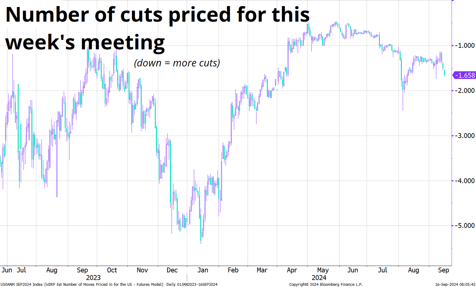
For your viewing pleasure, here is the evolution of the pricing for this week’s meeting. Barring some sort of truth bomb from the Fed, I would assume we are going to grind towards nearly fully pricing 50bps by Wednesday and then the Fed will dutifully deliver.

It’s hard to look at the first Fed cut and then say: Hey, let’s see what happened last time. I mean, it only takes a couple of hours of grinding inside Excel[1], but the regimes are all so different that the output is hard to interpret. In terms of starting points, here are the dates of the first Fed cut in various cycles, and where Fed Funds was relative to the US 2-year yield. This helps distinguish the cycles of 2019, 1998, and 1995 (where there wasn’t as much room to cut, presumably) vs. now, 2007 and 2001, where the market viewed the amount of feasible cutting to be much juicier.
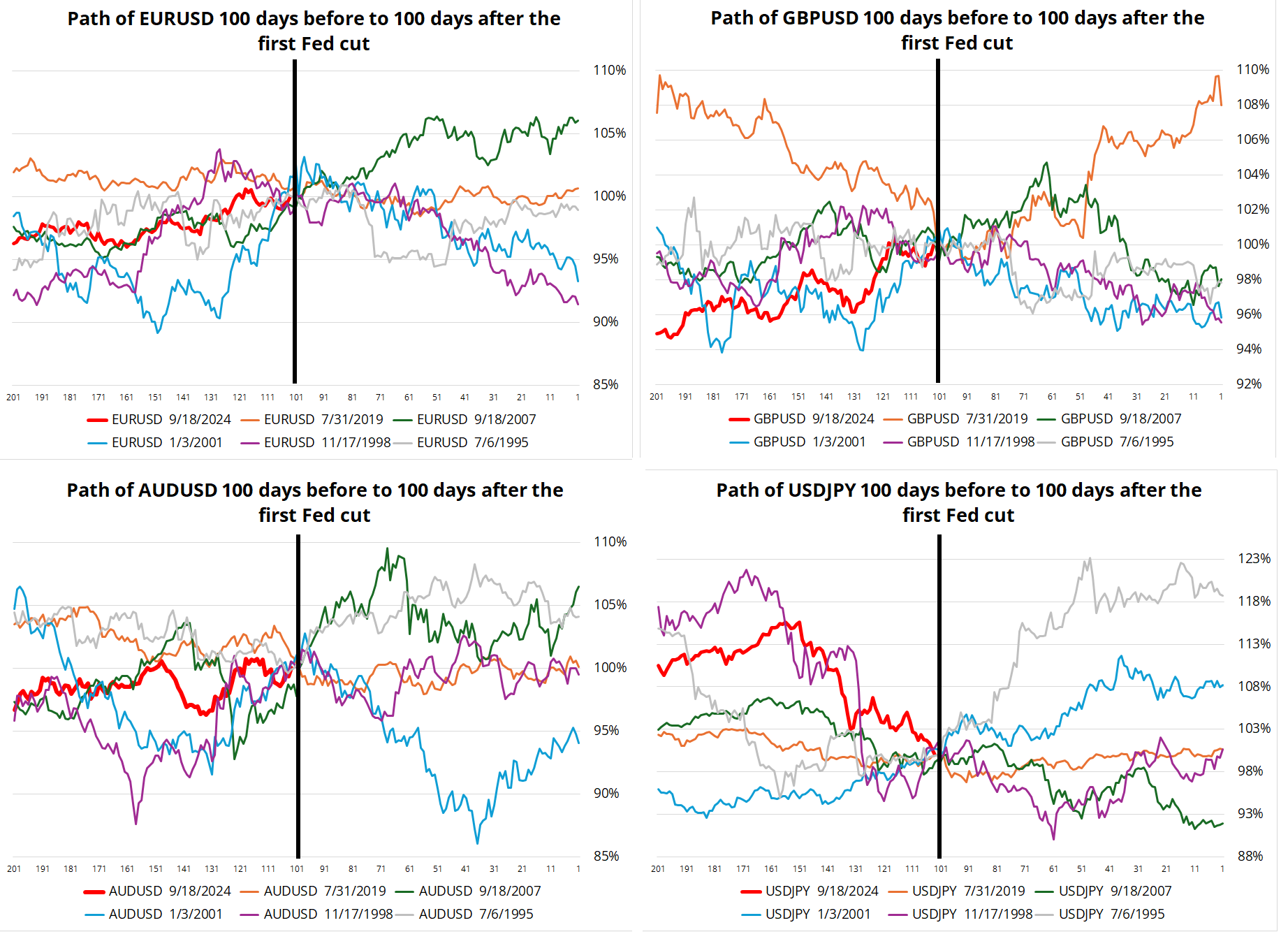
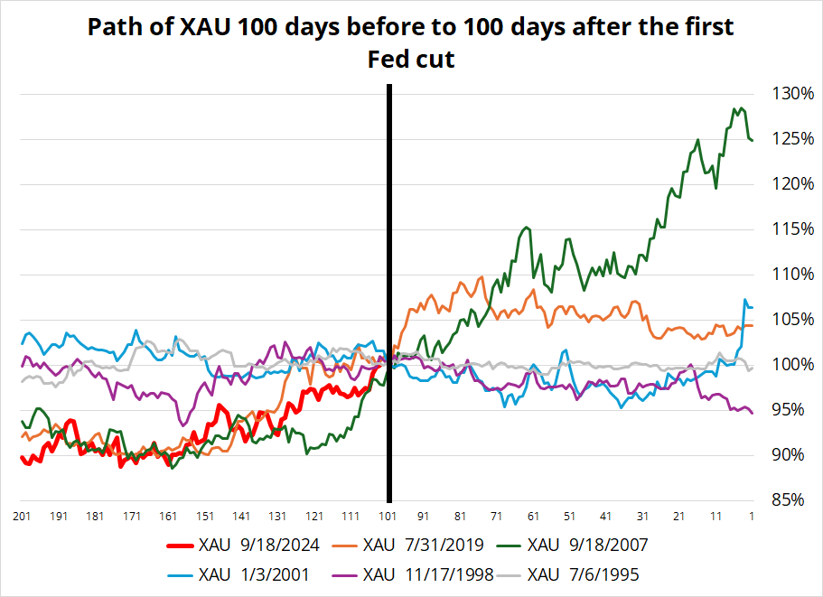
The charts that follow show the performance of various assets in the 100 days prior to, and after the Fed’s first interest rate cut. I start with a technicolor spaghetti chart, then offer some takeaways after, but I encourage you to come up with your own—and then share them with me. :]
Let’s start with currencies…

First of all, there is no obvious direction after the Fed cuts. The USD went up in 1995 and 2001, it flatlined in 1998 and 2019, and it went down in 2007. GBP was in a Brexit deal whipsaw in 2019, hence the huge drop and huge rally. Those cable moves had very little to do with the Fed.
The next chart shows gold. In all cases, it rallied into the first Fed cut, and other than 1998, it rallied after, too. Still, 1998 and 2001 saw profit taking after the cut, while 2007 and 2019 saw the rally continue. Gold was not very volatile in either direction in 1995, so that’s probably a useless comp.

What about interest rates?

The y-axis shows basis points. It’s intriguing to me that there was not much followthrough in yields, either. 2007 obviously saw a big drop (green line), while you had much higher yields in 1998 as the LTCM and Russia crisis were resolved with a liquidity injection and the crescendo of the dotcom bubble soon followed. Even in 2001, when there was a recession, 10-year yields were higher, not lower 100 days after the Fed cut.
Finally, SPX. Again, no real clear story to tell here. 2001 saw the dotbomb implosion, 2007 was the GFC, but 1995, 1998, and 2019 all saw higher stock markets. This is a pretty simple one: If (recession) then stocks lower. If (soft landing) then stocks higher. Your call!

In conclusion, there is no clear buy the rumor sell the fact or continuation trade when the Fed starts a cutting cycle. The market is pretty efficient and prices in a given cycle. Then, it just comes down to whether we enter a recession, or not.
And even if you know whether or not a recession is coming, you still don’t know for sure what FX will do (!) Final chart below shows the percent of the time each asset was above or below its Fed cut day level after 20, 50 and 100 days. Sample is five.

I would guess you are now more confused, not less, but the key takeaway here is that the first Fed cut does not unlock an obvious macro trade. By the time the Fed cuts, the trade already happened.
—
[1] This is why am/FX is so late today. Today’s charts took an abnormal amount of time to create!
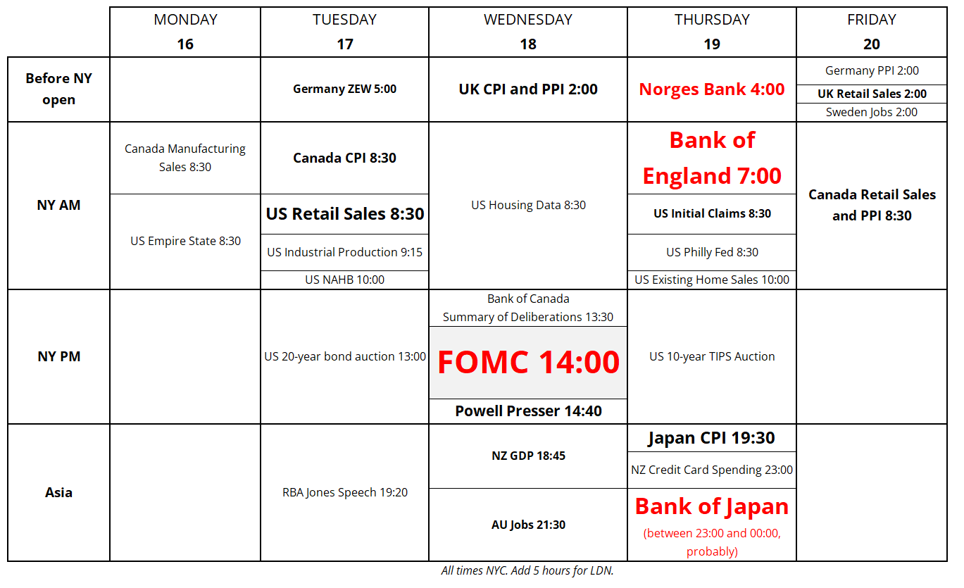
This week’s highlights include meetings from four of the ten big central banks, including the Big One. We also get ZEW, US Retail Sales, and meaningful data from the UK, AU, NZ, and CA. Here it is, for your week ahead planning purposes.

Forecasting is hard. Have a heart-shaped day.


This is the graph of
x² + ( y — ³√(x²))² =1