Rabbit Hole #10
Correlation Mediation
Welcome to Rabbit Hole #10. The Rabbit Hole series offers deep dives into random trading and macro topics that fascinate me. Today I look at an evolution in my thinking about correlation and mediators of correlation. This thought process would have been useful when I was unprofitably going long AUD on rising terms of trade in past years.
Why we need good explanations
I have written extensively about trading correlations between markets over the years and my thinking on how this all works has evolved with time. My first observation, in the 2003-2006 periods was simply: Hey! When this happens, this other thing tends to happen after. For example, when gold goes up, AUDUSD goes up.
That was fine for a while, then I tried to put some rigor behind it and found most of the mathematical approaches didn’t add value over and above simple observation + overlays. If anything, regression created false precision and implied a static or forward-looking mathematical relationship when the relationships between assets are anything but consistent or purely scientific.
Still, simply observing the relationships doesn’t give you enough insight to allow you to predict the future of the correlations. If all you know is that when oil goes up, the USD goes down (as was the case for much of my career), you are not going to be in a strong position when that regime changes and the relationship breaks down, disappears, or even reverses. I wrote about the changing relationship between the USD and oil in am/FX: One Less Vulnerability.
So, I tried to uncover the logic and transmission mechanisms behind some of the correlations by thinking a bit more deeply. Some of this was inspired by a philosophy that has gained momentum as my career progressed: If you can’t explain what’s going on, you’re going to struggle to predict what happens next. And the less able you are to explain a phenomemon in markets, the more likely it’s random. That’s why I spend so much time trying to explain why seasonality is real (or not), and why correlations make sense (or don’t). Good explanations are a necessary input to good forecasts.
What causes cross-market correlation? Are there mediators?
In an April 2021, I wrote a piece titled “What causes cross-market correlation” and I have posted it as an Appendix at the end of today’s. It ties in with the rest of what I am about to write and it’s my primary thinking on why correlations happen. Recently, I have been reading The Book of Why by Judea Pearl and Dana Mackenzie. As a non-statistics person who is super interested in correlation and causation, I really enjoyed the book. It’s niche and a bit wonky but understandable enough.
Chapter 9 of the book is titled “Mediation: The Search for a Mechanism” and begins as follows:
In ordinary language, the question “Why?” has at least two versions. The first is straightforward: you see an effect, and you want to know the cause. Your grandfather is lying in the hospital, and you ask, “Why? How could he have had a heart attack when he seemed so healthy?” But there is a second version of the “Why?” question, which we ask when we want to better understand the connection between a known cause and a known effect. For instance, we observe that Drug B prevents heart attacks. Or, like James Lind, we observe that citrus fruits prevent scurvy. The human mind is restless and always wants to know more. Before long we start asking the second version of the question: “Why? What is the mechanism by which citrus fruits prevent scurvy?” This chapter focuses on this second version of “why.”
The search for mechanisms is critical to science, as well as everyday life, because different mechanisms call for different actions when circumstances change. Suppose we run out of oranges. Knowing the mechanism by which oranges work, we can still prevent scurvy. We simply need another source of vitamin C. If we didn’t know the mechanism, we might be tempted to try bananas.
The word thar scientists use for the second type of “Why?” question is “mediation.” You might read in a journal a statement like this: “The effect of Drug B on heart attacks is mediated by its effect on blood pressure.” This statement encodes a simple causal model: Drug A ➔ Blood Pressure ➔ Heart Attack.
In this case, the drug reduces high blood pressure, which in turn reduces the risk of heart attack. Likewise, we can summarize the effect of citrus fruits on scurvy by the causal model Citrus Fruits ➔ Vitamin C ➔ Scurvy. We want to ask certain typical questions about a mediator: Does it account for the entire effect? Does Drug B work exclusively through blood pressure or perhaps through other mechanisms as well? Mediation is also an important concept in the law. If we ask whether a company discriminated against women when it paid them lower salaries, we are asking a mediation question. The answer depends on whether the observed salary disparity is produced directly in response to the applicant’s sex or indirectly, through a mediator such as qualification, over which the employer has no control.
I thought this was an interesting excerpt as it pertains to the now-solved AUD currency vs. Terms of Trade puzzle. For several years, market participants (including me) relentlessly banged heads on keyboards, going long AUD in response to massive improvements in the country’s terms of trade. But as I wrote in March 2023, the mediator in this case is RBA policy.
If a booming terms of trade transmits to the jobs market, capex, and eventually interest rate policy (as it did during the commodity supercycle 2010-2013), it matters for the AUD. If it doesn’t (like in 2018 and 2021), it matters—but it matters much less.
Here’s an excerpt from a piece I wrote in March 2023:
Oswald’s Boots
About once every six months, I feel like I need to write a piece going through my thoughts on why AUD is so weak. It has so persistently underperformed terms of trade for the past few years and there are numerous explanations including:
- Commodity strength in this cycle does not generate capex or jobs like it did 2011-2014.
- Strength in commodities generates mostly dividends, not capex in this cycle, so the profits from mining in Australia have no transmission to the real economy. They make investors rich, but don’t impact growth much.
- Strength in Australian terms of trade has no transmission to monetary policy for the reasons stated above. If commodity strength does not impact monetary policy, it’s not necessarily all that relevant for the currency.
While I am always posting AUD vs. copper and charts of that ilk, every now and then I have to zoom out and remember this chart.
AUDUSD vs. Terms of Trade and 2-year yield differential
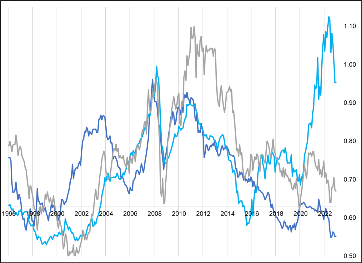
Basically, the terms of trade explosion doesn’t mean much if there is no transmission to monetary policy. I have to keep reminding myself of this. The point is particularly relevant with the RBA set to meet next week.
end of excerpt
One could think about the causes and mediators of the USD vs. oil correlation and do some similar work. The cause (US energy dependence) is no longer in force as the US is now a net exporter of energy. And even in the later years of net energy imports, the mediator (sovereign wealth funds and central banks recycling and diversifying out of dollars as quickly as possible) no longer worked either.
The idea is to think about the process by which a correlation works. What are the direct and indirect causes, and what are the mediators? We can do this by creating a diagram. In the book, they use simple cause effect diagrams and I think those can be useful. They force the analyst to think about logic before constructing models or calculating r-squareds. Does AUDUSD listen to copper, for example? That makes sense to me given Australia’s reliance on copper exports. Does copper listen to AUDUSD? That’s harder for me to get my head around and therefore if I were drawing a causality diagram, I would put the arrow from copper to AUD, not the other way around. This exercise is subjective, but going through a logical thought process and coming to a conclusion is more likely to work in future vs. brute force data mining to find a relationship that you can’t attach any logic to.
Or maybe because I’m not a quant, that’s just how I think. But I strongly prefer cause / effect statements that I can explain with some sort of underlying logic (see Appendix for my six main sources of such logic).
As a thought experiment, I created a causality diagram for copper and AUD. There isn’t really any new information for me in here, but the idea is that creating these diagrams for other relationships will help to understand them. And so I plan to do so in the future with less obvious (apparent) relationships like bitcoin and NASDAQ. In the diagram, I used “higher copper” and “higher AUDUSD” to make it easier to understand, but everything would work in reverse, too.
Much of the relationship between variables in markets can be handled by a simple explanation: A third variable drives them both. That’s point #2 in the appendix. Here I’ve listed global growth, Chinese growth, the direction of the US dollar, and global risk appetite as four important confounders of the copper / AUD relationship because all four of those things drive both copper and AUD. I’m doing my best to use the correct statistical terminology here but if have a PhD in applied mathematics from MIT you may be giggling to yourself here and there. I’m still learning!
I added one new dimension to the Judea Pearl diagram. Time is measured on a logarithmic scale where time passes quickly at first and then more slowly as you move left to right. Here’s my diagram. It is not meant to be a complete list of everything that happens when copper and AUD tango, it’s just supposed to tickle the idea generation and explanation machines inside your parietal lobes.
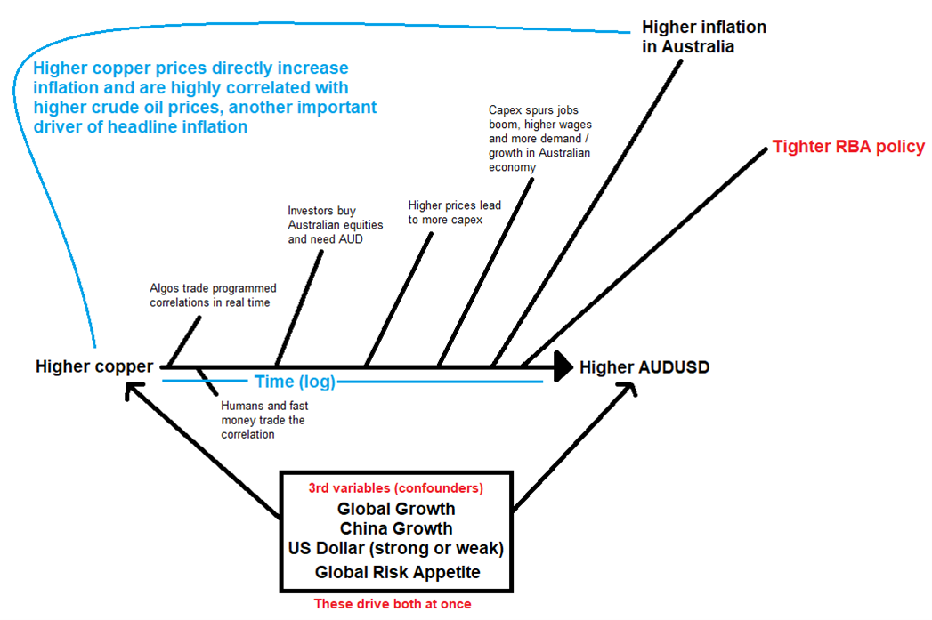
I believe that constructing accurate diagrams of this type can help me predict when correlations will change in the future. They certainly help me think through the mechanisms of correlation and possible causation. Over time I can compare my cause-effect diagrams to empirical reality and decide whether or not they are still valid. This should help avoid mistakes like the AUD ToT Puzzle and warn of coming regime changes.
Calendar
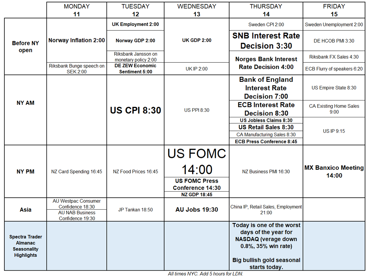
The consensus from readers is that I should provide the calendar on Friday to help you get ready for next week and then repeat it as an appendix on Monday so you don’t have to dig up the Friday am/FX every Monday when you sit down. So that’s what I’ll do. Here’s the calendar for next week. Plenty of meat! Check out that manic 9-hour stretch on Thursday.
Wow.
Final Thoughts
14 Amazon Leadership Principles and Why They Matter via MM.
Have an intergalactic weekend.
APPENDIX: am/FX excerpt
Friday, April 09, 2021
Forexplainer #24
What causes cross-market correlation?
Welcome to Forexplainer Number 24. As I explained on March 12, 2019 (AM/FX: Forexplainer 1): Once a month I publish a longer-form piece called “Forexplainer”. Sometimes it is something educational I have read elsewhere, and sometimes it is something I write myself.
1,150 words (5-minute read)
On Wednesday I wrote a piece suggesting that bitcoin and AUDJPY have been correlated throughout 2021 and are likely to remain correlated going forward. A few people asked me why or how that correlation would manifest. Inspired by that question, today’s piece is about the concrete mechanics of correlation. I will briefly discuss seven ways the abstract concept of cross-market correlation plays out in the real world.
1. Arbitrage and substitution. This is an easy one in its simplest form. If bitcoin is selling at 57,500 on one platform and there is a bid at 57,600 on another platform, that’s pure arbitrage’. There is also a more nuanced version of this that looks a lot like arbitrage, but is not. This is usually called basis or RV trading.
Closest to arbitrage is the basis between two fungible or nearly-fungible products like futures and spot. You can sell GC futures and buy physical gold and at some point in the future the prices are very likely to converge. This is not arbitrage though! There is a significant basis and mark to market risk. Still, this basis-related near-arbitrage is the reason nearly-fungible products like futures and spot, or ADRs and their underlying stock price, exhibit very high correlation.
Moving along the spectrum from arbitrage to basis to RV… If you build a curve of all the crude oil futures prices and there is a kink in the curve that puts the DEC 2023 high relative to other contracts, you can sell DEC and buy a contract on or below the curve and have an excellent (but not risk-free) chance of making money.
Substitution is further out on the same spectrum. This is the dynamic where a rise in the price of one asset will lead consumers to buy a cheaper substitute. If corn doubles in price, those who can switch to soy will do so, pushing the price of soy futures higher. If Doordash rips higher and now looks overvalued, investors looking for food delivery apps to invest in might buy GrubHub instead.
2. Third variable. Often when two asset prices move up and down together, they are responding to a third variable that relates to them both. This is the most common driver of the correlations I talk about and it is the reason trading lead/lag is logical. Most of the assets moving around on your screen are responding to the same set of macro stimuli.
For example, if there is growing optimism about Canadian growth, CAD will trade stronger and Canadian interest rates will rise. The third variable (Canadian growth expectations) is the key driver of both USDCAD and Canadian rates. This will show up as high correlation between the two markets and the snazzy overlays that frequently decorate AM/FX.
Opportunities arise when one market moves more slowly than the other and the signal from one gives clues to the direction of the other. This could be because of non-price-sensitive flows against the grain in one market but not the other. For example, if the outlook for China growth is improving and copper is ripping higher but a huge M&A is going through selling AUD, you might see a divergence form. The moment the M&A transaction is complete, AUDUSD will snap higher to where it “should have been” given the rally in copper and the rosy outlook for China.
This Third Variable explanation explains why AUDJPY and bitcoin are correlated. Both are driven by marginal global liquidity. As global liquidity increases, optimism (and speculative fervor) increases and new money flows into risky assets. Some of that money flows into crypto and the optimism encourages AUDJPY buying. It is not that AUDJPY traders are watching bitcoin, necessarily, it’s just that they are both driven by the same principal factor.
3. Cash flows. When one asset moves, it can generate cash flows in another asset. For example: When a Canadian crude oil producer sells their crude, they receive USD. They need CAD to pay their employees and shareholders so after they sell their crude, they need to sell USDCAD to convert the proceeds. If the price of crude doubles, the crude producer will have twice as many USD to sell and this will weigh on USDCAD.
This is one mechanism that drives the USDCAD vs. crude oil correlation. If you have ever worked at a bank with a strong Canadian presence, you know those flows are an important piece of the USDCAD puzzle. Another example is an Aussie mining company might increase its dividend if iron ore prices are persistently high. These dividends will lead to AUD buying as many of the firm’s shareholders are based in UK or USA. These direct cash flows are large and important.
While cash flows are a significant driver of the correlation between commodity currencies and commodities, cash flows can also be important in other pairs. If US yields move higher, Japanese investors will find those higher yields appealing and will buy US fixed income securities. These purchases will drive the USD higher and generate a correlation between US yields and USDJPY.
4. Cross ownership / liquidation / forced selling. Speculators tend to take positions relating to broad macroeconomic themes. For example, at the moment the theme is inflation so the macro positions are: short bonds, long USDJPY, long copper and so on. When there is significant movement in one of those assets (even if views on the global growth outlook have not changed),
it will trigger acitviity in the other markets as owners of the basket react to the changes in their P&L.
For example, as bonds have rallied this month, views on the reflation trade have not really changed. Still, specs are getting hurt… So they move to cut other positions (like long USDJPY)…. The more bonds rally, the more USDJPY they need to sell to staunch the bleeding.
5. Correlation traders and algos (self-fulfilling prophecy). Since people know that certain products are correlated, they won’t wait for the cash flows or cross-ownership flows to kick in. If oil rips $2 higher, algos and humans all over the world will sell USDCAD.
6. Volatility and systemic risk. As systemic risk rises and risky assets fall, correlations rise. Every asset has an idiosyncratic risk component and a systemic or macro risk component. Idiosyncratic risk (say, supply and demand for copper) loses importance when systemic risk is high. Intense risk aversion pushes all correlation towards one as the only thing that matters is the rise or fall of the systemic risk. This is also explained by…
I hope you found this useful.
End of Appendix