We are getting more, not less confused.
Hello. It’s Friday. Thanks for signing up. I’m Brent Donnelly.
We are getting more, not less confused.

Hello. It’s Friday. Thanks for signing up. I’m Brent Donnelly.
Here’s what you need to know about markets and macro this week
Don’t make the same mistakes everyone else makes.
Jump-start your career in finance by learning how to see, analyze, and trade the market effectively.
Click here for info.
We are getting more, not less confused.
It looked like NFP, ADP, ISM Manufacturing, and Initial Claims were all pointing to a meaningful slowdown in the US jobs market, but now it looks like we were at least partially fooled by randomness as there was a big hurricane effect in the Unemployment Rate release, ISM Services data came in stonking, Atlanta Fed GDPNow is still at 2.9%, and Initial Claims have oscillated back down. Economists wish they could operate with the comparative ease and scientific rigor of weather forecasters, but they can’t. There is no science. Only art.
This art vs. science dichotomy is the reason people derisively call economics a pseudoscience, and has been on full display this cycle as all the old models have been wrong. Persistently pathologically pessimistic predictions by prognosticators continue to prove anything but prescient. I have the luxury of being allowed to change my mind whenever I want, but real economists have high switching costs; they can’t just change their minds over and over.
So. you get what we had here last year:
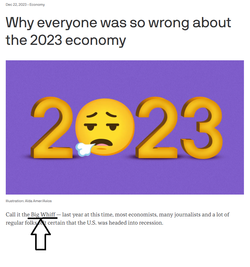
https://www.axios.com/2023/12/22/2023-economy-predictions-wrong-recession
It’s optimal metagame for doomers to stay dooming and for H4L bros. to keep H4L’ing long after both theories have been put to rest by the data. You can always find a bespoke economic datapoint to support any view. If you don’t like that data point, take a look at the non-seasonally adjusted version. That might suit your view better. Try digging into the details. I’m sure there’s something there to match your priors. Traders have the luxury (and the financial imperative) to change their minds at will. Professional media spokespeople with quarterly updates to send out do not.
This isn’t a criticism of anyone, it’s just a reality you should be aware of when consuming financial punditry. Know the bias of the people you are listening to before you make any judgment as to the validity of their forecasts or frameworks. Some people will stay with a smart-sounding, busted framework for 5, 7, or 10 years after every piece of evidence shows the framework is useless.
So, this week we got a counter to the bad news last week. And while last week I thought we may have finally shifted into a lower economic gear, now I’m not so sure. Data dependent!
The craziest thing this week was the Sunday/Monday move in every asset class. You probably read a lot about those moves already.
The second craziest thing that happened in macro this week was a bunch of gigantic market moves on the back of a 0.54 standard deviation better-than-expected Initial Claims release. There wasn’t much economic data to chew on this week, so markets were desperate for anything. As such, the Initial Jobless Claims release on Thursday got about 75 times its normal attention. The release came in 7,000 below expected, which is very modest good news on the economy (fewer applicants for unemployment = good news). Note the standard deviation of Initial Claims misses (actual vs. economist expectations) is 13k and the miss was 7k. So that’s a 0.54-sigma miss. In other words, a random deviation from expectations.
Here’s what stocks did in response:

That’s a 150-point jump on the data and a 450-point jump over five hours.
That’s a spicy meatball.
This is the kind of move that gets people screaming “This makes no sense!” and “The market’s broken!” and “I can’t stop out here!” One of the most important things you learn early on in trading is:
It doesn’t always have to make sense.
Economic logic is not hard-coded into market pricing. Very often, market moves are more the product of human madness than they are of macro- or microeconomic reality. This was one of those moves you see in high-vol markets when things trade like everyone’s short gamma, and nobody has a good idea of how far or how fast things might move. Ideally, you always want to be trading like you are long gamma (buying low, selling high) not short gamma (buying high, selling low).
I made a fake product.


I am not sure if this is a joke. Maybe we’ll sell these slides. I truly don’t know.
Another big story this week was the Flippening, as Comma-Lah Harris did her best Quincy Hall impersonation, streaking past Donald Trump in both the polls and the gambling odds.
The Flippening is here.
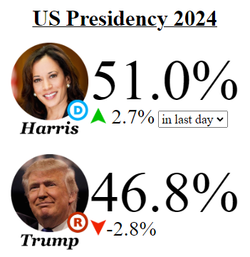
That graphic is from www.electionbettingodds.com, which aggregates gambling odds.
Polymarket, which seems to be considered the best, most liquid (and most pro-Trump) odds show $275,000 of liquidity selling Trump at 49% and 50%. This is the first time he’s been 50 offered on Polymarket since mid-May. Interesting! I continue to believe there will be fiscal drag and anti-debasement worries if this continues because the renewal of the TCJA and continued lower for longer corporate tax rates are not at all guaranteed under a Harris administration. The regulatory risks for crypto will also be higher under Harris than they would be under Trump, and this is marginally bearish for crypto.
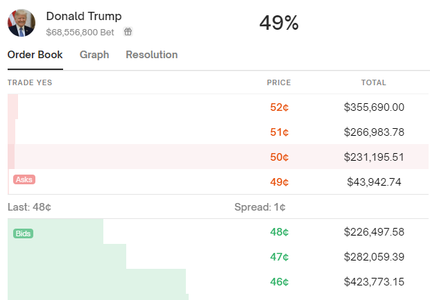
People on Twitter like to debate whether these odds are right or wrong. They are neither. They are simply an expression of where people are willing to bet real money on either side. It’s like arguing that SPX is wrong. OK, sure. Then bet the other way.
I use the odds as the best possible estimate of what is priced in for the election. I don’t have an opinion on the election outcome itself and I cannot even vote in the USA. The delta (direction and speed of change) of the odds is what matters most for markets. Not the history of gambling odds as a predictor of major events.
As mentioned, Thursday was a kookaburra day in stocks, but then again, every day this week was wild. We have transitioned from zero volatility to sideways-eight volatility almost overnight. Check out the huge gap on Sunday/Monday as the JPY carry trade shifted into Nantekotta Mode™.
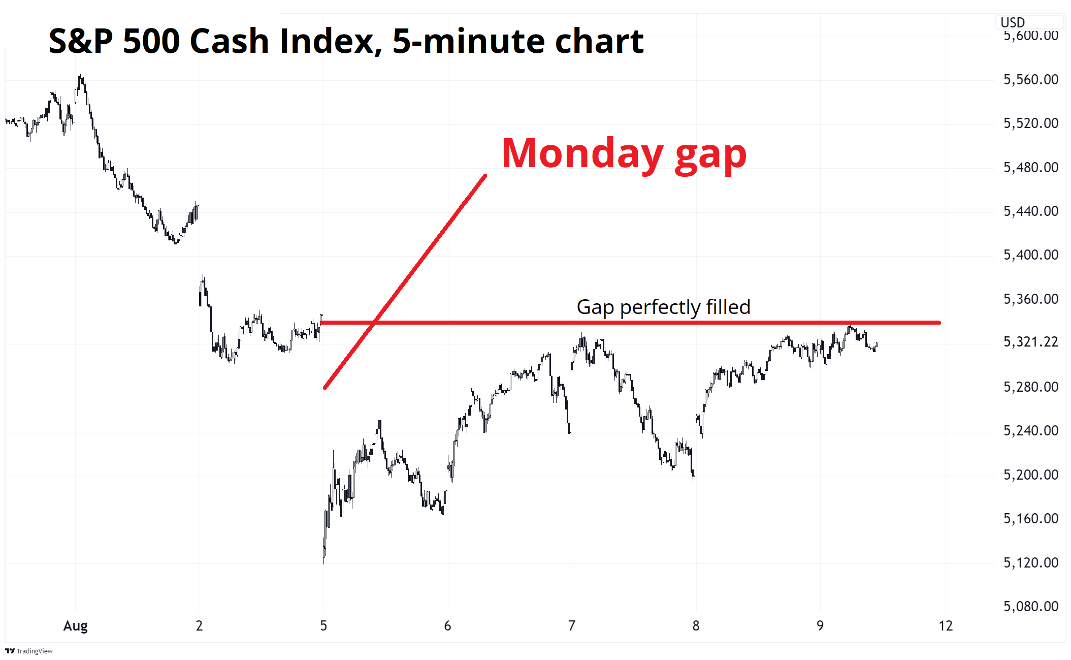
Nantekotta is a polite Japanese word for WTF.
While I would love to write up a full explainer on the yen carry trade, there are already 77 people that beat me to it on Twitter. More broadly, there is very often a large group of correlated positions in the market and those positions can build and build over time. When one breaks, they all break. This time, the positions were:
These are all trades that benefit from low volatility, soft landing vibes, dreams of future monetary debasement, and trend. Sure, the Bank of Japan hiked rates and that was a major contributor, but it was also a perfect storm of bad news for everyone and all their positions at once. Note that the same funds and investors long, e.g., FX Carry, were probably long Nikkei, short vol, long crypto, and/or long NASDAQ too. Funds, humans, and algorithms that like one popular trade are likely to like all the other popular trades, too.
When volatility spikes, correlation shoots up, and the fire in the disco effect kicks in as everyone runs for the same tiny exit at once.
This is why people say carry trades eat like a bird and shit like an elephant. Personally, I would never say that, because it’s too crass, and I am super highbrow. But many people do say that.
So, when the BOJ hiked and went all hawkish, it triggered a domino effect and global markets reeled. This brought back all sorts of scary memories, whether they were of 1998, 2008, or 2018. The Bank of Japan has a long and glorious history of hiking rates only to watch their domestic stock market fall 50%.
See here:
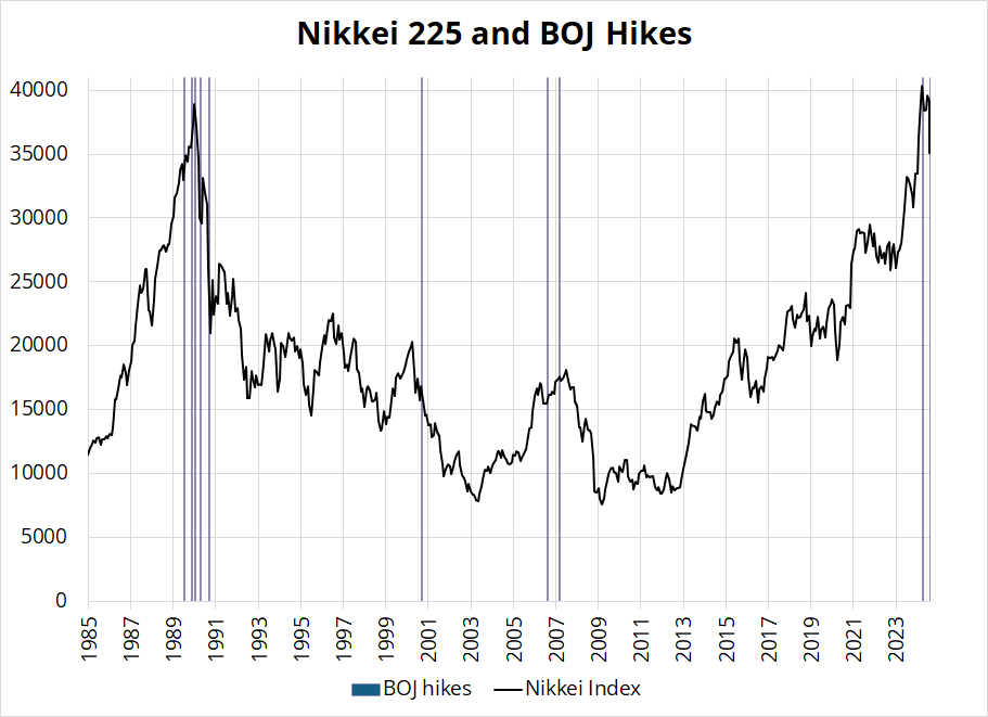
The recipe for this selloff in stocks was:
These huge selloffs and panics happen when it’s the end of the world, but they also happen quite often when it ain’t.
I posted this chart on Twitter as a joke and it was pretty fun. It was my fourth-most liked Tweet ever.
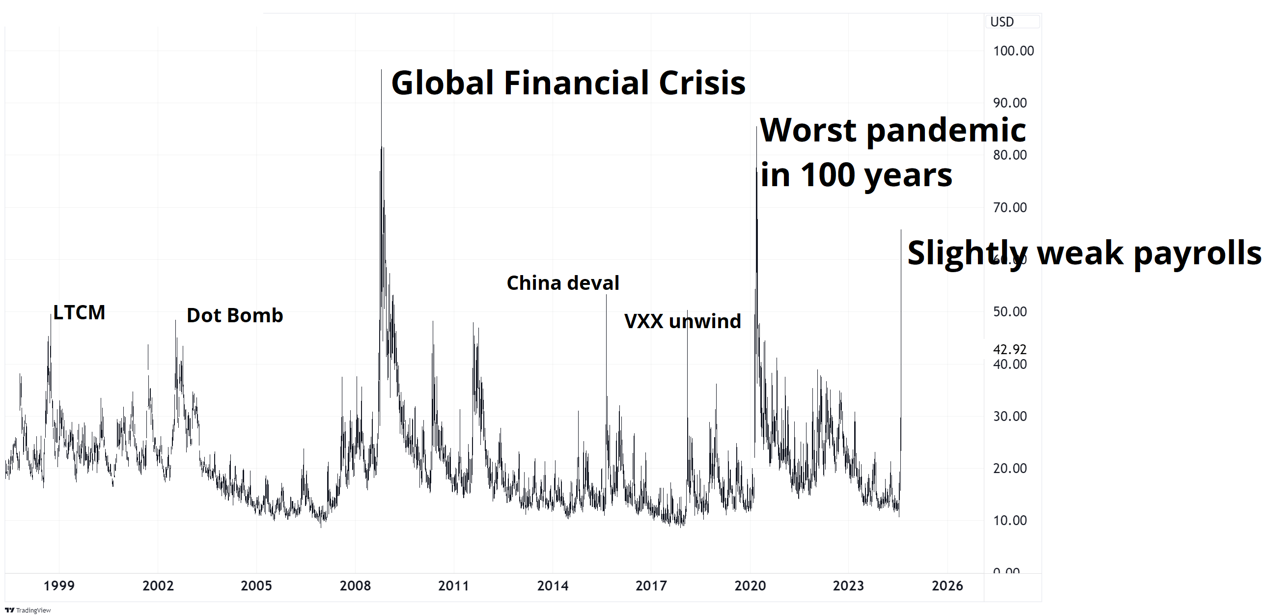
Here is this week’s 14-word stock market summary:
Tokyo goes Nantekotta Mode. Fire in the disco, but we all got out alive.
US yields careened lower last week and the two-year yield hit a low of 3.60% by 8 a.m. NY Monday, but then everyone realized that the world is not yet over and now we’re back above 4% again across the curve.
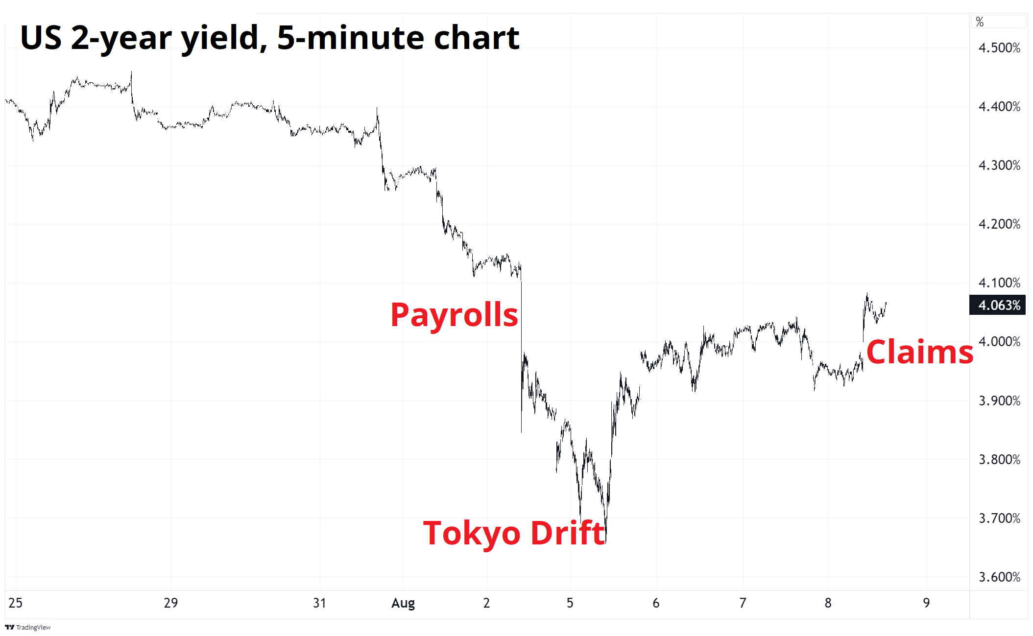
2s10s are just five basis points from disinverting as Fed pricing continues to suggest more than 25bps of reduction at the September meeting. 50 beeps in September looked like a fait accompli a few days ago, but now we are left to wonder whether that Nonfarm Payrolls number was just wrong. It’s possible!
450,000 people could not report to work during the week of the Household Survey, and this might have added as much as 0.2% to the Unemployment Rate. And while the Manufacturing ISM Employment series signaled Armageddon, the same series for Services was comfortably above 50. Services account for 75%-80% of the US economy, so that Services ISM probably matters much more than the manufacturing one.
We were told at the end of April 2024 that Japan was in a crisis, their currency was in full collapse, the MOF was powerless, China was about to devalue the yuan, and Asian Currency Crisis 2.0 was game on. Now, we’re being told that the JPY is going to skyrocket as infinity billion carry trades lurk underwater, ready to sink the global financial system.
Here’s a couple of pages from my scrapbook:

So much to talk about here:
Anyhoo! Narratives can be fickle.
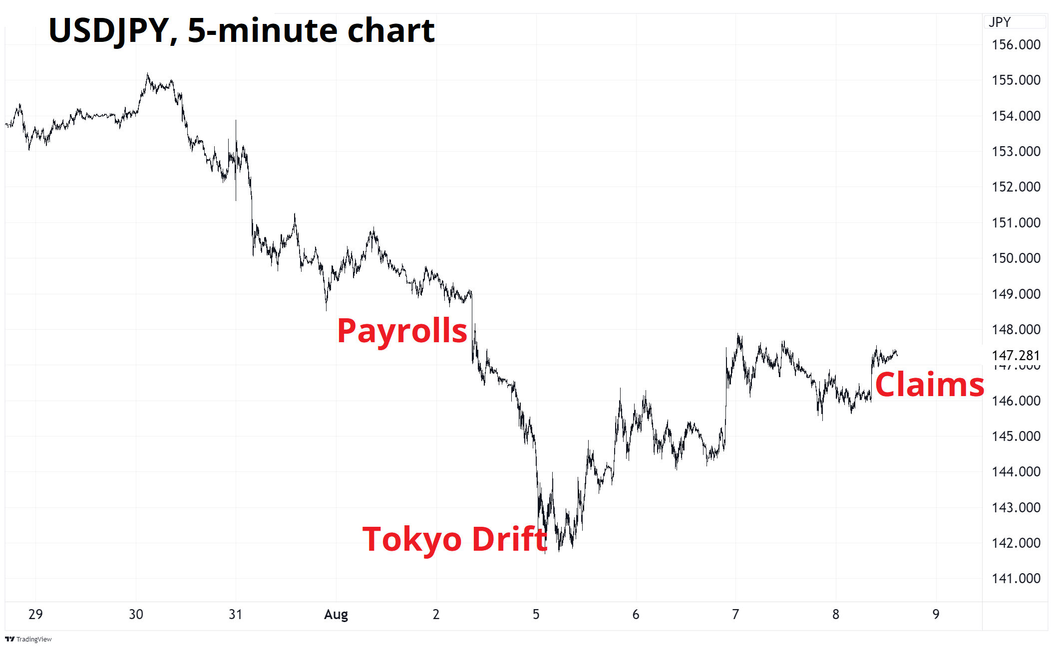
USDJPY looks like this over the past 10 or 12 days:

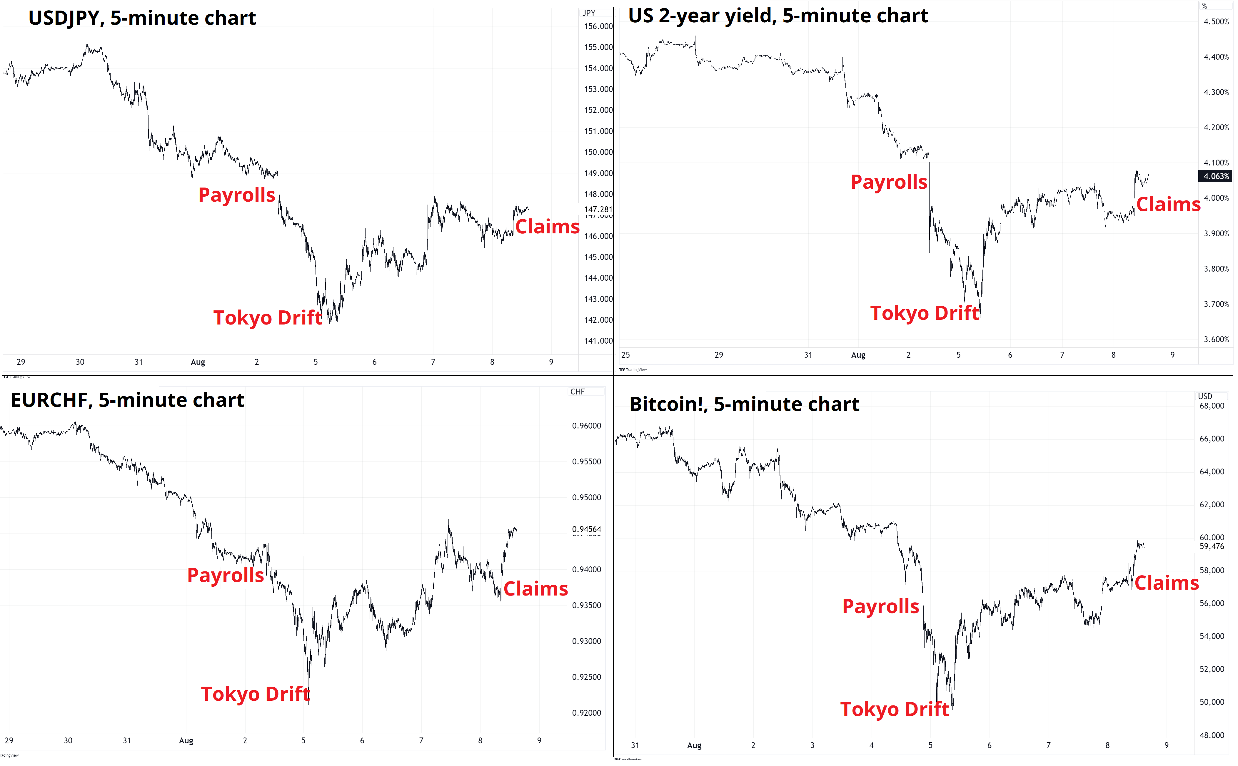
Scroll back up to the chart of US 2-year yields and you will notice that the USDJPY and the 2-year yield charts are identical. That’s correlation! In fact, when positioning and fear dominate markets, correlation tends to shoot up and create all kinds of similarity across many charts. Even EURCHF, a currency pair that is supposedly reflecting EU vs. Switzerland, looks like that this week:
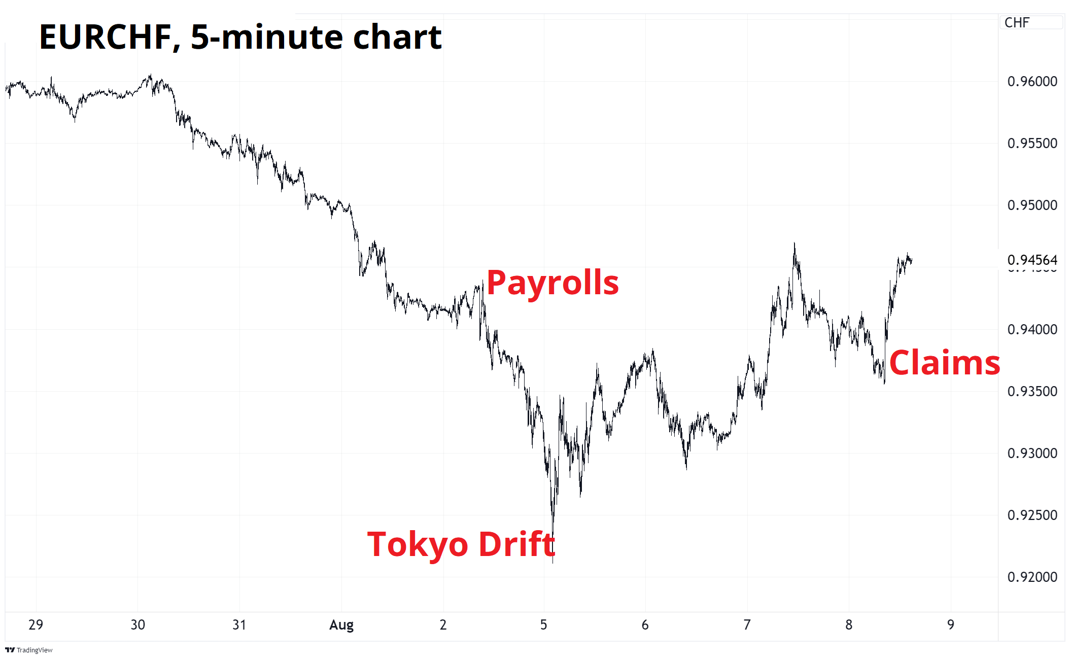
It takes a creative mind to reverse engineer why a 0.53 standard deviation stronger US Initial Claims drives the euro 1% higher vs. the Swiss franc! But like I said at the top of the show—it doesn’t always have to make sense.
Turning to the Krypto Korner, let’s bring out a different framework to analyze this completely uncorrelated asset class. Remember that bitcoin is a new, better form of sound money. It’s a government censorship, and hacker-resistant protocol. It’s a store of value like no other. A peer-to-peer electronic cash system, even!

Oof.
It seems more like bitcoin is just another Wall Street flow product / risky asset just like all the others. You can be long silver or long bitcoin or long gold or long QQQ. For now… It’s all. The same. Thing.
BTC: You have been fully institutionalized, exactly as Ben Hunt predicted.
It is fascinating how nobody talks about oil anymore. Like, it’s barely a thing at all. The collapse in 2015/2016 after the China deval, the move to negative futures prices during COVID in 2020 and the explosion higher in 2022 all feel like distant memories.
There was this idea that oil was the new safe haven and we had entered a New World Order in 2022 as the Russian invasion and SWIFT ban by the US changed everything and oil to the moon and dedollarization and USD to zero.
But none of that was true. Here is a monthly chart that shows how many stories Bloomberg has published about oil since 2015.

If you know oil’s price history over this period, you will note that the media only covers oil when it’s going up. That’s because of negativity bias—the media naturally covers big scary world-shattering narratives but ignores moments when nothing is going on or when good news happens like low real gas prices help the US consumer keep spending (like now).
Here are gasoline prices adjusted for wages in the United States, to give you an idea of how remarkably stable prices have been over time. Note that 1980 and 2008 were huge jumps. See y-axis .. A doubling of the real price of gasoline each time. But nature is healing. The best cure for high prices is high prices.

Trading-wise, oil is making a gigantic triangle. These are formations that appear when price remains confined, and volatility drops. The prices moves in smaller and smaller ranges before eventually breaking out one way or the other. Corbi describes it as “coiling” which I think is a good way to capture the energy that builds during a triangular consolidation.
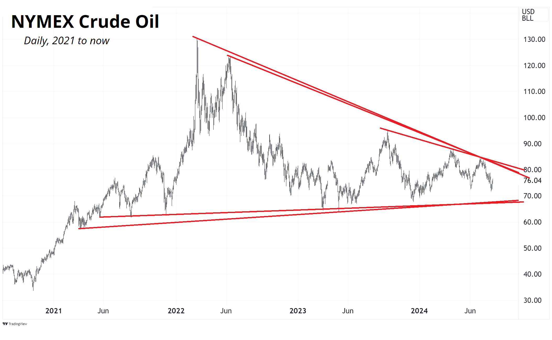
We could be in this triangle for ages still, as the apex is still months off. The decisive break would be down through $60 or up through $90. Considering the performance of most other commodities, falling demand from China, and the overall disinflationary vibes around the world… My bet would be $60 breaks before $90.
Whew! OK! That was 11 minutes. Thanks for reading Friday Speedrun.
Get rich or have fun trying.
Smart, interesting, or funny
Ted Gioia: How to know if you’re living in a doom loop
A short, insightful essay. Gioia is one of the most on-the-mark writers in the world. He also peppers his essays with interesting facts. I like interesting facts.
What Drives Crypto Asset Prices?
This is a more academic approach to the question I have often posed and answered. Here’s a simple chart that mostly answers the question. Since being institutionalized in 2021, Bitcoin!™ is a risky tech asset with a libertarian fanbase. Check out the paper for a smarter, more nuanced, and detailed approach.

The photo finish in the Olympic 100m final

Nuts. The American’s head came second but what matters is when the torso crosses the finish line. Wild!
Music

In a 2023 interview, JPEGMAFIA said he wants to make music that “tears you out of yourself.” This album does that. It’s hard to describe. A cross between modern rap, Rage Against the Machine anger/noise/punk/guitars, and Radiohead production quality. It’s not the kind of thing you just listen to one song, though. The whole thing is a thing.
JPEGMAFIA: I LAY DOWN MY LIFE FOR YOU

Thanks for reading the Friday Speedrun! Sign up for free to receive our global macro wrap-up every week.