Lots going on, much of it weird

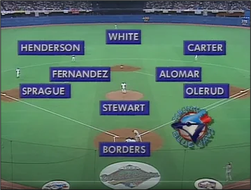
It’s been a while since the Toronto Blue Jays won the World Series.
11,686 days, in fact.

Lots going on, much of it weird

It’s been a while since the Toronto Blue Jays won the World Series.
11,686 days, in fact.
Flat
We get CPI this Friday, and while I lean towards an as expected or strong figure given underlying price pressures in series like PriceStats and ISM Prices Paid, there is more potential than usual for variance as the process could have been hindered by the shutdown. The shutdown started October 1, so presumably the manual data collection for September was not affected, but who knows how many corners are being cut to get the thing out so they can do the COLA adjustment. In reading about the release, I was surprised to see how much of the collection is still done manually.
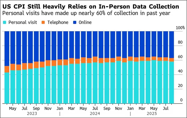
From the Bloomberg article that featured that chart:
Every month, BLS sends price collectors all over the country to businesses like grocery stores and doctors’ offices to track a sample of goods and services that consumers spend on. That’s different from other government surveys, where companies can often directly submit their data online.
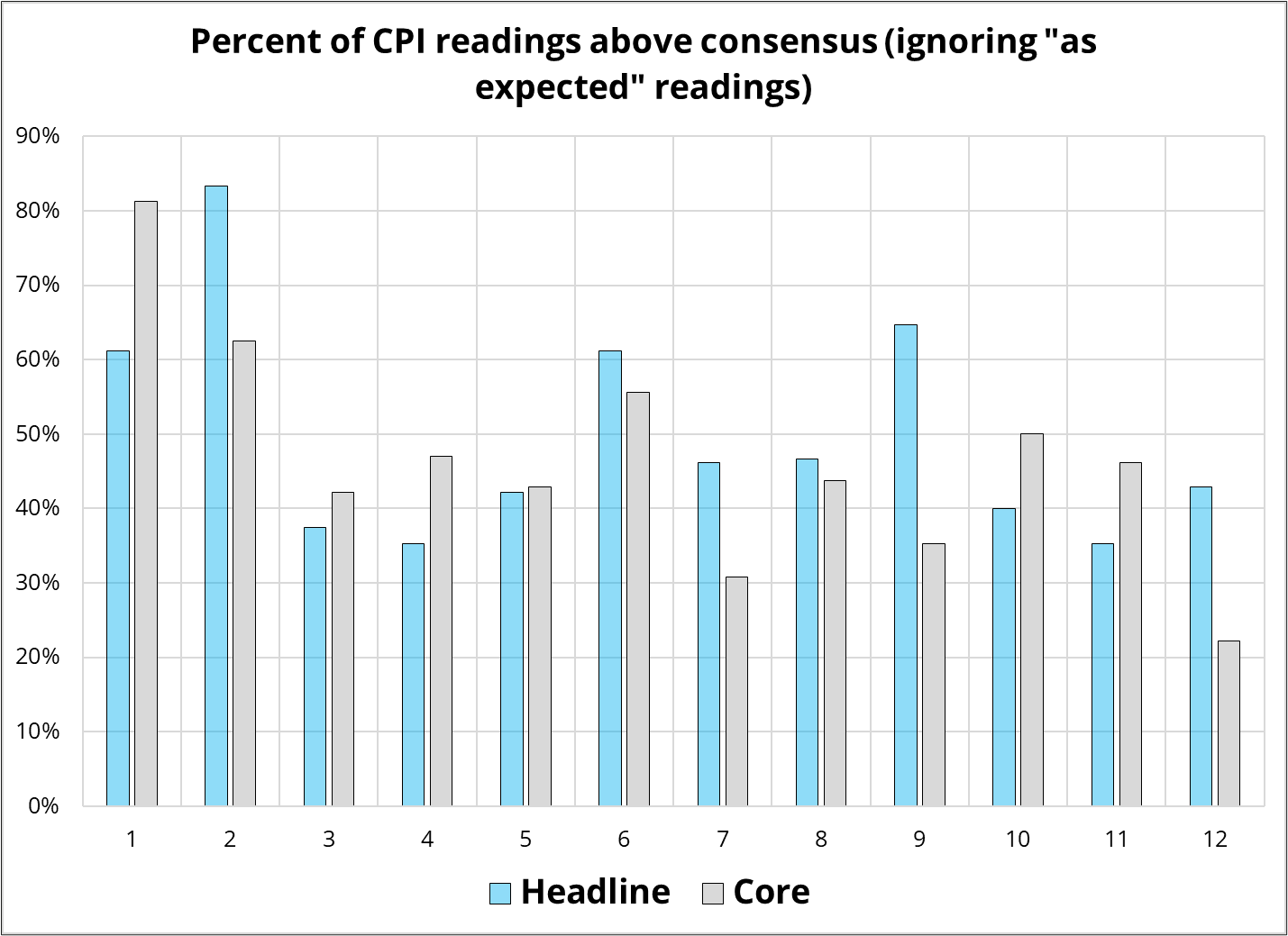
This is how it’s done in 2025! Wild. I am pretty sure there is a more efficient way. Anyway, the October report is much more at risk of data collection issues than the September one. The seasonality in CPI tends to skew heavily towards strength in January and February, followed by weakness throughout the rest of the year, but September is one of the less-weak seasonals as you can see here:
Nothing to write home about here, but just FYI.
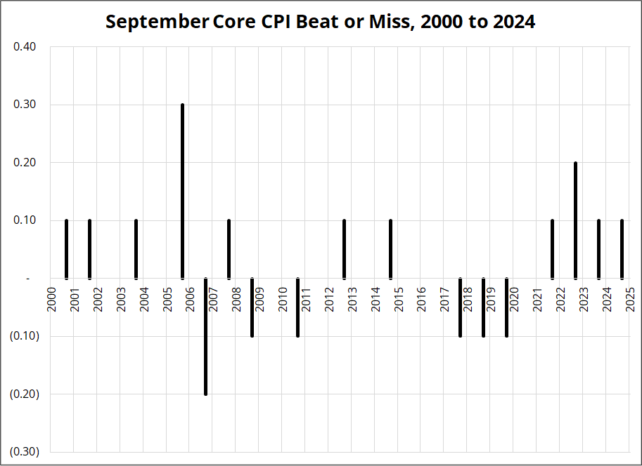
I suppose whoever is putting together CPI is worried about their job if the data shows strength, but I don’t think we can really factor that into any analysis. Here are the individual results for September Core over the past 24 years.
Normally, you would think that a strong CPI should be bullish USDJPY, bearish stocks, and bearish bonds, but everything is weird these days and the Fed doesn’t really seem to care that much about inflation in the 3% area. So, while those will be the kneejerk moves, I am not sure they will be sustained.
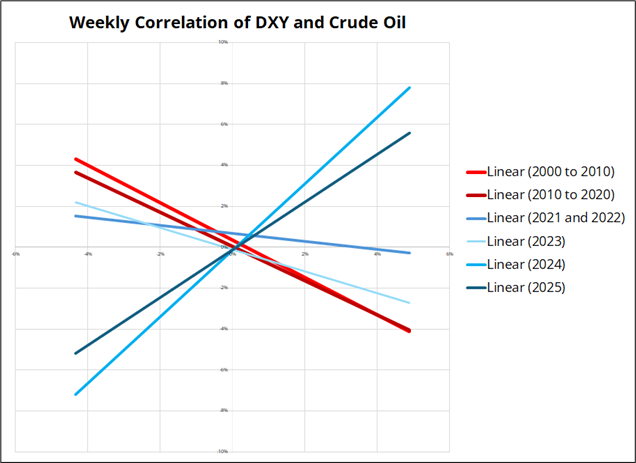
To give you a sense of how weird things have been on the correlation front post-COVID, have a look at the next few charts. I simply plot the weekly performance (change) of a variable against a currency, with separate colors for a selection of periods.
Let’s see how the standard correlations in FX have been working. I created scatterplots of some of the ye old correlations, then blanked out the dots so you can just see the trendlines. The blue lines are the post-COVID years, and the red lines are the decades before COVID. Here’s the first one:
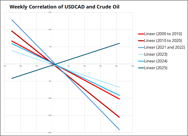
The shale boom and turn from US as net importer to net exporter of energy removed the USD’s vulnerability to higher oil and reversed the correlation. This obviously impacted the USDCAD vs. oil correlation, too, as did many other factors as discussed in am/FX: Divortium. Look at 2025!
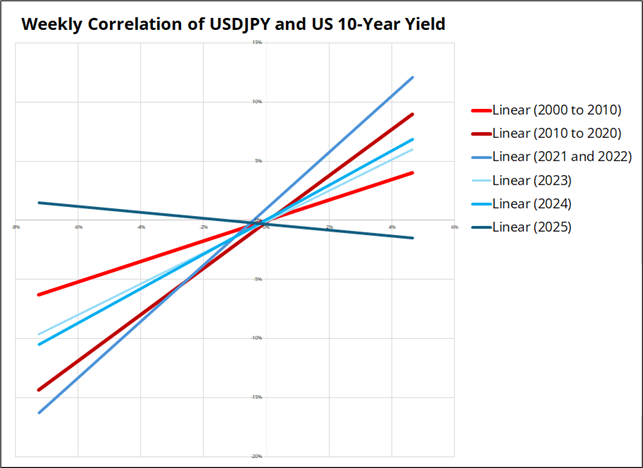
And 2025 has not been kind to the USDJPY vs. 10-year yields correlation as well!
AUD vs. copper is one of the last bad, but you get the idea. Correlations have disappeared across FX.
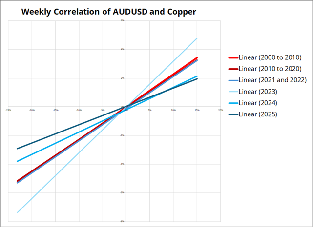
This drop in correlation has also coincided with a year where seasonality hasn’t worked (after it worked very well in 2023 and 2024) so there is a particular aspect of this market that is nothing like we have seen in prior years.
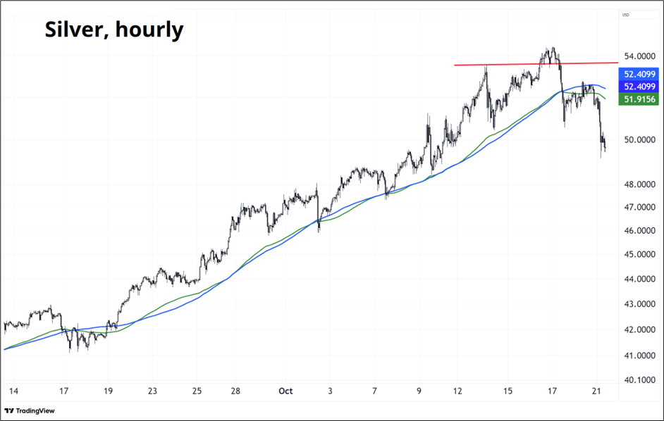
Silver longs are increasingly at risk because the jump we are seeing in volatility increases the probability of margin hikes at the worst possible time. The chart is ugly as the moving averages roll over and $52.40 held perfectly on the bounce. The huge support is at $46. Maybe the bubble was in silver, not AI Capex? Let’s see.
Have an OK (OK!) day.
It’s been a while since the Toronto Blue Jays won the World Series.
11,686 days, in fact.
The last time it happened, I was in 3rd year at University of Western Ontario.
Guess who’s in 3rd year at University of Western Ontario right now?
My son! Neat.