Taking a look at how USDJPY is historically almost always a rates trade, plus an update on the most popular coins in crypto.
Memories of scarier days

Taking a look at how USDJPY is historically almost always a rates trade, plus an update on the most popular coins in crypto.

Memories of scarier days
December 28, 2023
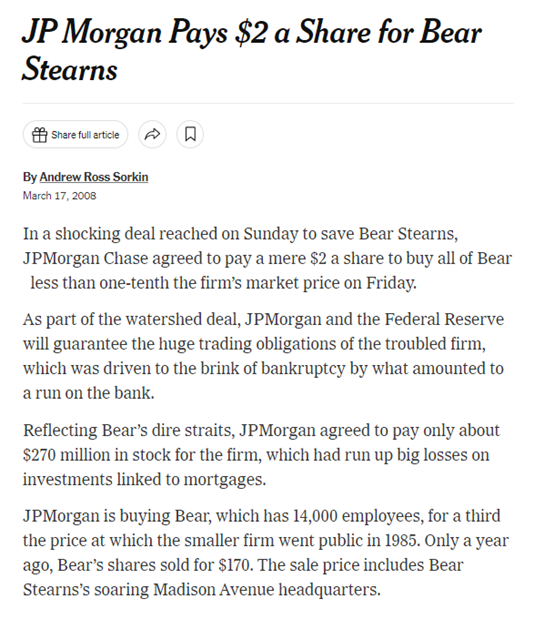
I was walking around Fairway Market in March 2008, pushing a toddler in an orange Bugaboo stroller with one hand and nibbling on not-yet-paid-for grapes with the other when my Blackberry started buzzing like mad. I looked down to see that completely surreal / absurd headline in the top bar. The stock closed at thirty-something on Friday, and this was clearly some kind of a typo. The purchase price must be $20? Nope. $2.
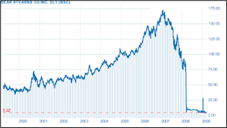
Bear Stearns stock, 1999 to 2008
Price was eventually renegotiated to $10
Very shortly after this announcement, the Fed announced a cut in the discount rate. Stocks and USDJPY shot higher. I thought: USDJPY is a rates trade, not a stock market trade, and I called Lehman Tokyo to sell 50 USDJPY. By the time I finished the groceries, walked home, and unpacked them, USDJPY was 200 points lower.
The point of this short story is that USDJPY has been a US rates trade, not an equity trade, not a safe haven bet, and certainly not a Bank of Japan policy trade… For my entire career. I was thinking about this because I was going over what happened to USDJPY in 2023 and the various temporary dislocations between USDJPY and US yields.
And while that story reflects conditions in 2008 and what I’m going to write in the rest of this piece reflects conditions in 2023, even the shock cut to negative rates by the BOJ in 2016 impacted USDJPY for only a few hours and then USDJPY went straight down for six months. It only rallied when excitement over Donald Trump’s procyclical fiscal stance emerged in November and US yields shot higher. And the story at the start of Alpha Trader is about the persistent but laggy USDJPY vs. yields relationship around the flashcrash in 2010.
If you would like to hear an audio version of that story, you can hear it here.
This is not to say that the USDJPY vs. US yields relationship is mechanical or guaranteed to work on every fractal. It’s a general framework that works consistently over time but not continuously every single day or every single week.
Turning to more recent times, this first chart is fun because of the shape of it. The chart below simply plots the level of USDJPY vs. the level of US 10-year yields from 2020 to 2023. I know plotting levels against levels is not rigorous, I’m only showing you the chart because it’s humorous in its Ouija-board-like message:
USDJPY vs. US 10-year yields scatterplot of levels, 2020 to now
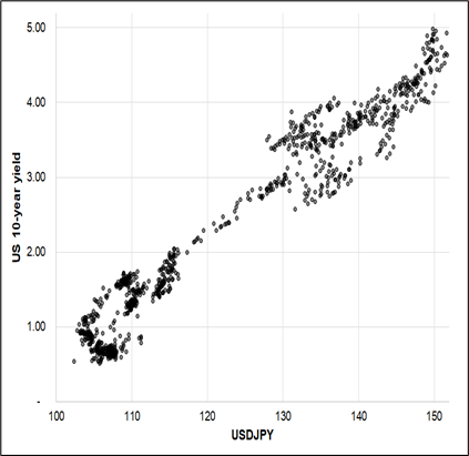
From the lower left to the upper right, as Dennis Gartman would have said. And if we look only at changes, we get a similar look. Note that I’m only using US 10-year yields here; I’m not even considering Japanese yields because they are so much less important. Most of the deviations from the standard trendline USDJPY vs. 10yy relationship can be explained by BOJ announcements. This highlights the short-term nature of BOJ news on USDJPY. It matters a ton around announcement or NikkeiLeaks day, but then the US takes over and drives the bus again almost immediately.
USDJPY vs. US 10-year yields (weekly change) scatterplot of weekly changes, 2020 to now
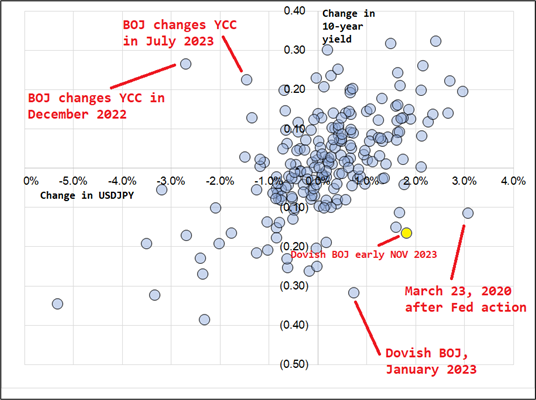
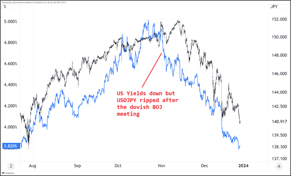
That yellow dot was a particularly annoying period for believers in the USDJPY vs. yields relationship as you can see in the next chart. That week, USDJPY went up almost 2% as US yields dropped 17 bps. But it was transitory.
USDJPY vs. US 10yy with red commentary marking the time of the yellow dot in the last chart
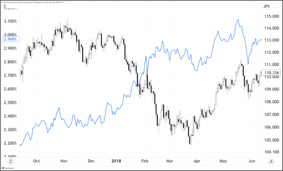
As Stoney used to say in my Citibank glory days part 1 (1995-1998)… If it was easy, it wouldn’t’ pay so well. And while these leads and lags can be disastrous, there is also the matter of USDJPY leading yields sometimes. That makes it even harder and more complicated. And then you have the occasional year like 2018 where the relationship temporarily breaks down for an extended period. There can always be temporary “sell bonds / sell USD” trades if you have perfectly synchronized global growth like we had in 2018.
USDJPY vs. US 10yy during synchronized global growth USD selloff 2017/2018
Conclusion: USDJPY is almost always a US rates trade, despite the painful leads and lags that can feel like torture when you’re waiting for the jaws to close. While we occasionally see other regimes (such as 2018) and one offs (such as BOJ days in 2022/2023)… The baseline framework should be to assume that USDJPY and US yields are correlated despite frustrating and variable lags and that whichever variable has the most momentum is setting the tone for direction. BOJ matters for a day or two. But yields have mattered for 20+ years.
Every June and December, I update my history of crypto spreadsheet. It’s a fun and moderately interesting way to see the evolution of the altcoins and how precarious their lives can be at the top of the league tables.
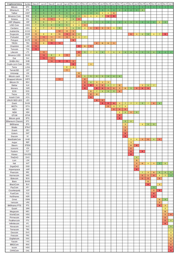
The rise of SOL, the appearance of TON, and the rise of AVAX are the notable features of this chart, while LTC has been relegated once again from the Hot 15.
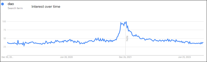
Are DAOs still a thing?
Well written piece via Sue Badeep Bows.
https://www.benlandautaylor.com/p/why-we-cant-have-nice-things
I have decided I am a Detroit Lions fan for the next 8 weeks. Go muscular feline apex predators!