
Talking about how my internal pattern recognition algorithm senses something is off here with this equity bear market.
highlights
This Is Not What a Normal Bear Market Looks Like


Current Views
Short USDJPY at 136.90
Stop loss 138.56
Take profit 132.36
March 3, 2023
This is not what a normal bear market looks like
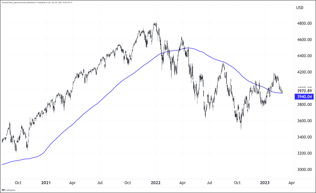
This is the fourth bear market of my career, and I was looking at the chart yesterday and my first thought was: “That doesn’t look like a normal bear market.” I could draw the 2001, 2008, and 2020 bear markets from memory—including the 200-day—and this one is atypical. The way we are up here, just hanging out above the 200-day moving average feels wrong. So, I went back and looked at all the other bear markets in history to see if my intuition is valid. Answer: Kind of, but not 100%.
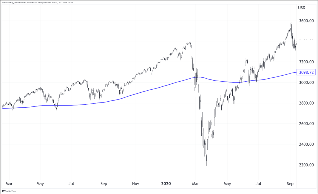
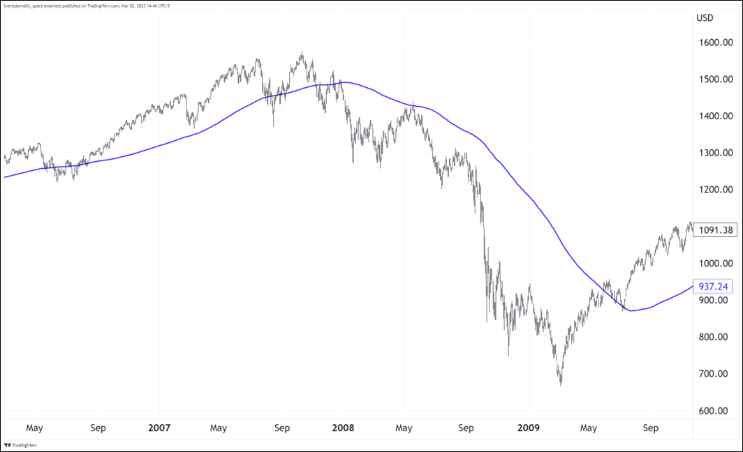
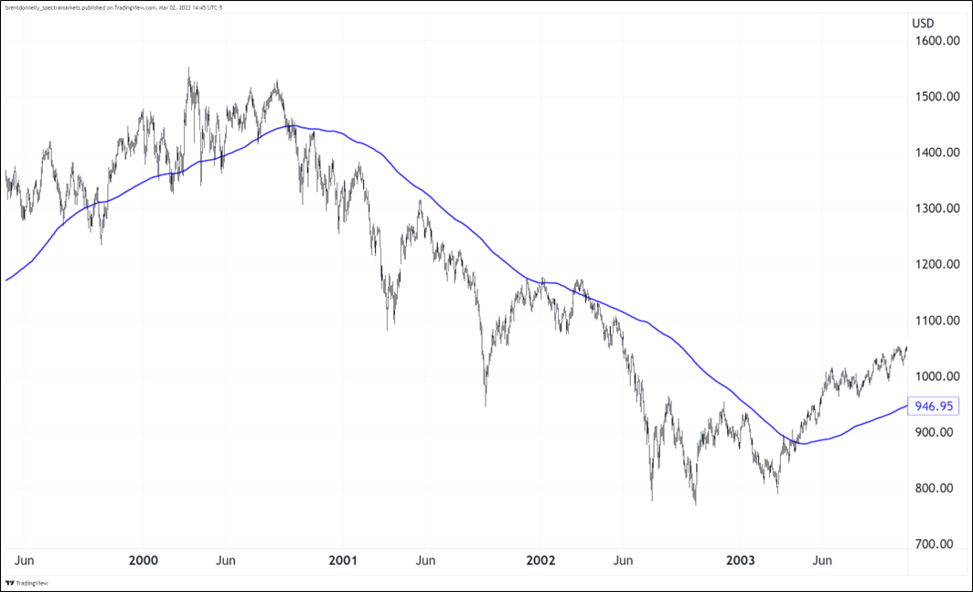
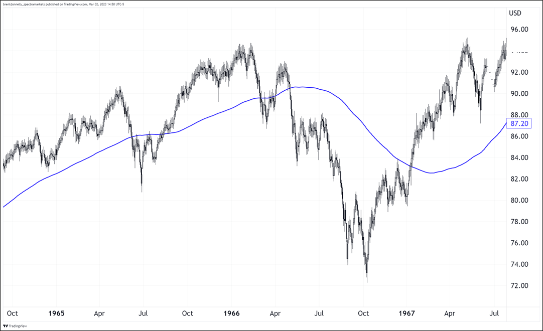
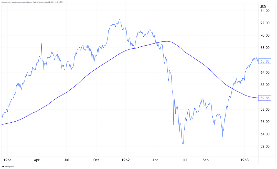
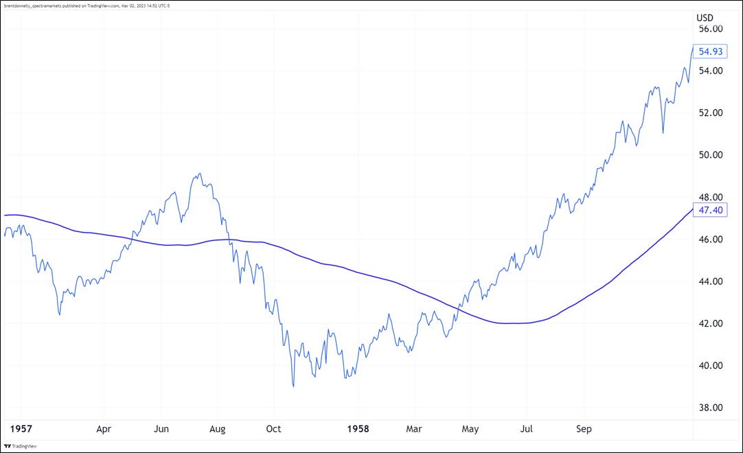
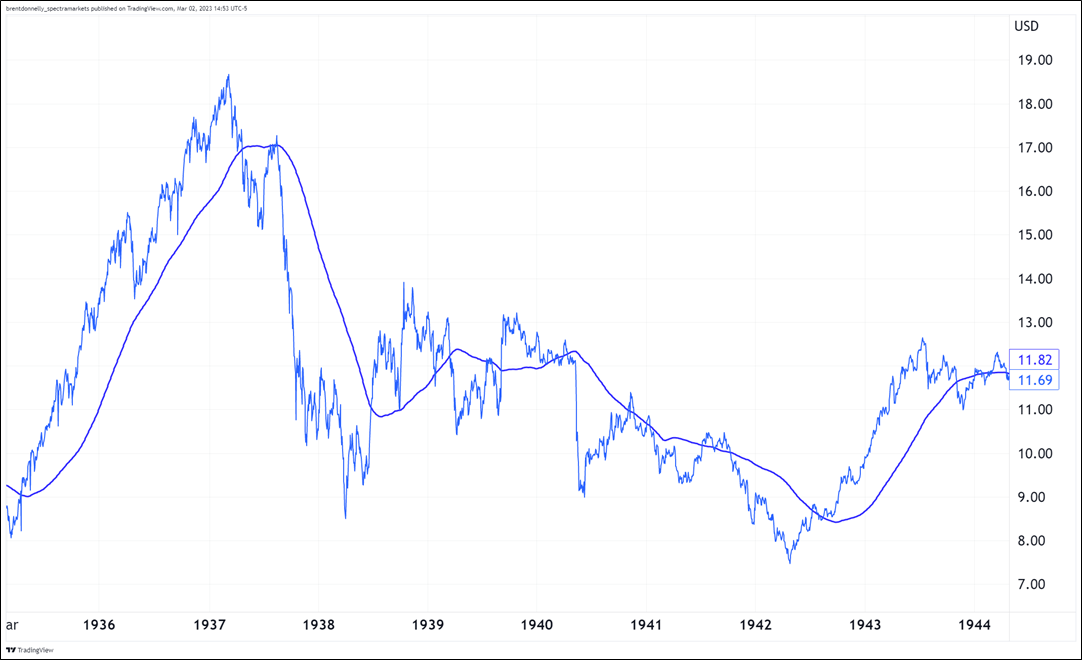
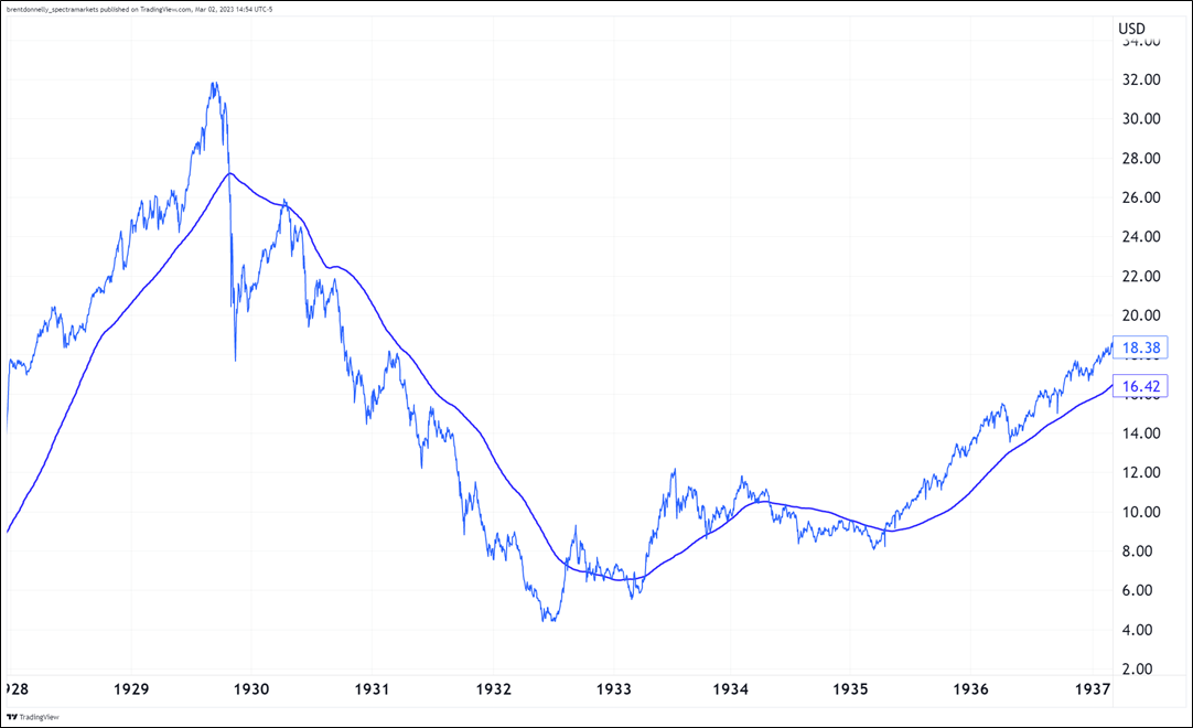
Scroll through the charts that follow and note the behavior around the 200-day moving average in blue. Normally, once we go below the 200-day, we stay below and when we get back above, that means the bear market is over. Here are the 14 charts…
Current bear market
2020
2008
2001
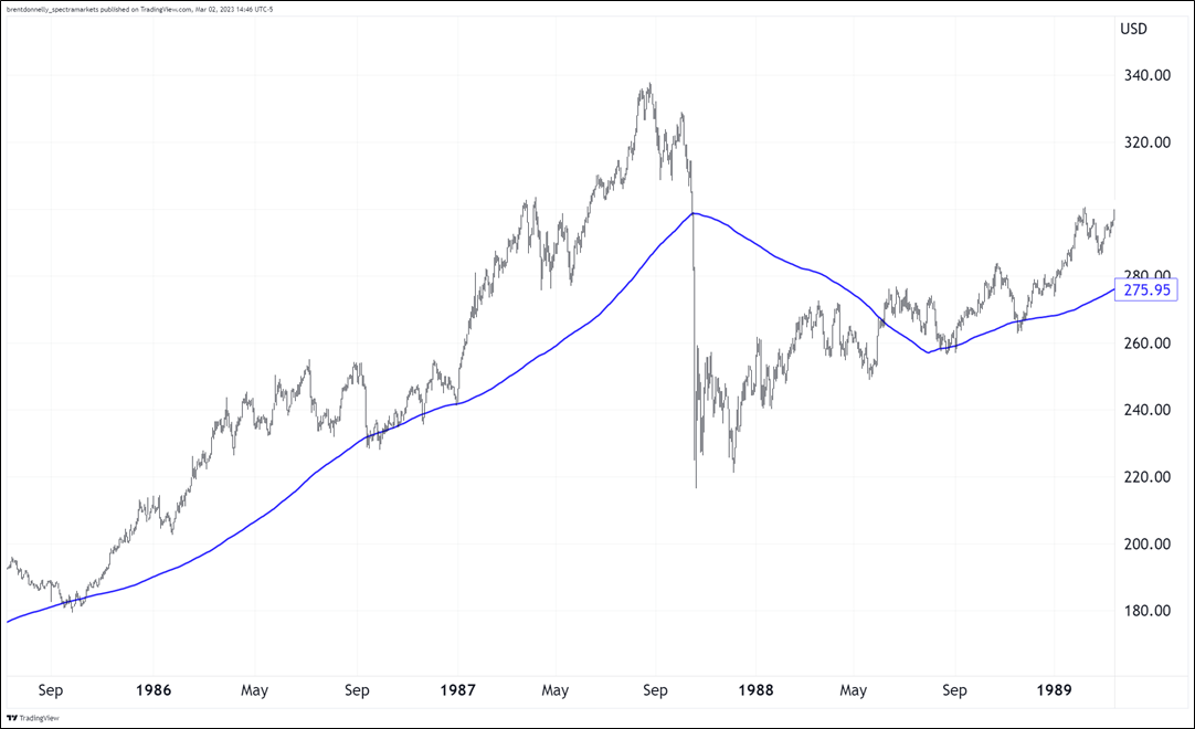
1987
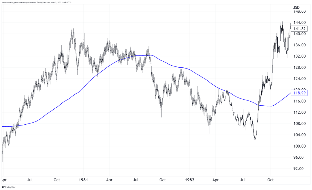
1982
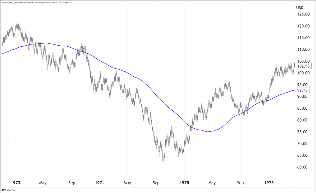
1974
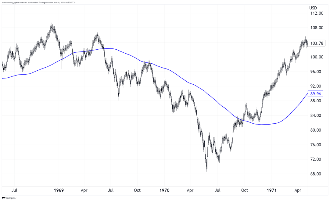
1970
1966
1962
1957
1949
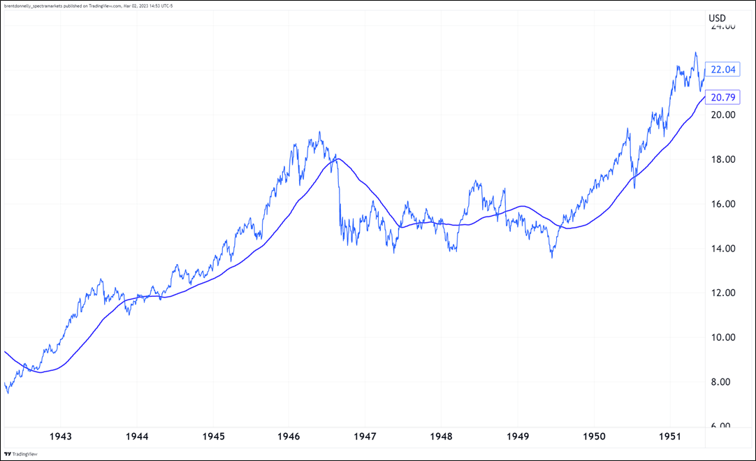
1942
Great Depression
That’s a lotta charts. What does it mean? I got Justin to put all these ingredients into the big data blender, and he produced a wonderful chart. The chart shows: After dropping 20% and triggering a bear market, how much time does the market spend above and below the 200-day before making its final bear market low?
After dropping 20%, where does SPX trade before making its final bear market low?
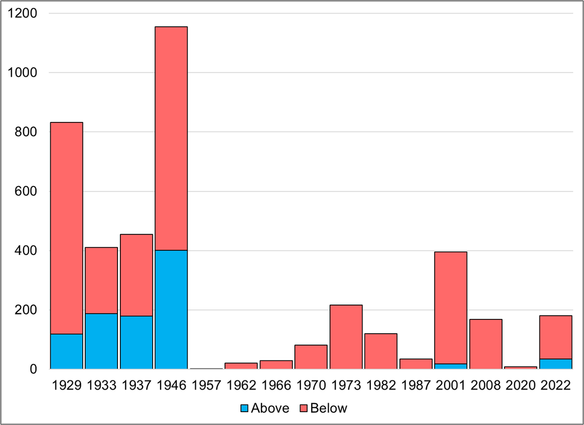
Year is start of bear market
Takeaways:
- Bear markets before 1950 looked a lot different than bear markets since then.
- The bear market after World War II was nasty. Basically a three-year range trade before the final low in 1949.
- The only bear market post-1950 that went above the 200-day before making a new low was 2001 and we were only above the 200-day for 18 days in that case. We have been above for 35 days now in this bear market.
- The 200-day is a pretty good indicator for trend following in bear markets.
This kind of stuff never gives you a hard and fast answer. But we just went through one of the worst seasonal periods of the year, rates repriced massively, T-bills yield more than 60/40, and earnings season is basically over. And we are still above the 200-day moving average. It’s kind of mind-blowing.
So we are left with the uncomfortable situation where you can make 250 great bearish economic and fundamental arguments for why stocks should be much lower… But they’re not. And we’re entering a bullish seasonal period and we may have just engaged in a massive exercise in recency bias where the market completely repriced the disinflation thesis based on a single month’s data.
This is one of those times where an open mind is probably more useful than a dogmatic commitment to the bear thesis. Stocks do plenty of stupid stuff. People were bearish stocks at the end of 1994, too as rates were ripping higher, the economy was scary strong, and both stocks and bonds were under pressure for most of that year. Stocks closed up 34% in 1995.
This article from January 1, 1995 is fascinating. The parallels to the current regime are startling. Here are a few excerpts:
In 1994, the best U.S. economic growth in perhaps 10 years begot the worst stock market since 1990 and the worst bond market in more than 60 years. Little wonder Wall Street so fears what the economy might do for an encore in ’95.
The seeming paradox–bullish times for business and workers equating with bearish times for financial markets–remains the focus of investor debate and concern worldwide as the new year dawns.
It’s easy to simply blame the Federal Reserve Board for 1994’s lousy markets, of course. The central bank tightened credit for the first time since 1989, seeking to rein in the economy and crush inflationary pressures before they developed.
The Fed-engineered surge in short-term interest rates–to four-year highs–drove long-term bond yields sharply higher, devaluing older bonds and causing devastating losses for bond investors and speculators, Orange County’s investment fund among them. And in the usual chain reaction, rising interest rates clipped stock markets around the globe. The Standard & Poor’s index of 500 blue-chip stocks fell 1.5% in 1994, not including dividends. Many world markets fell much more.
If the Fed were the markets’ sole problem, the worries might be over soon enough. Although the Fed is expected to raise short-term interest rates further this year to cool the still-strong economy, it’s a reasonable bet that the most substantial rate increases are behind us. Short-term rates, after all, have already doubled from a year ago.
But some experts now see a larger issue confronting Wall Street. The Fed notwithstanding, they say, the sun is finally shining on the “real” economy of goods, services and the workers who provide them. Hard assets and people have value again. And for a number of reasons, that may relegate the “financial” economy–meaning stock and bond markets–to the shadows for a while.
“Wall Street had a big party for three years,” from 1991 through 1993, says David Shulman, investment strategist at Salomon Bros. in New York. “Now it’s Main Street’s turn.”
In effect, wealth now is being transferred from the financial economy to the real economy–a reversal of what happened in the early 1990s, and in fact for much of the last 13 years.
From 1991 through 1993, an anemic real economy allowed for plunging interest rates that dramatically bolstered the value of stocks and bonds. That enriched investors, even as many non-investors feared for their jobs.
A simplistic, but safe way to navigate this is to simply be bullish stocks above the 200-day and bearish below. The risk, obviously, is you get chopped up. But the risk of sitting there bearish stocks all the way to new all-time highs is much greater.
USDJPY
The USDJPY trade is off to a good start but it’s early as my target is way down there on a 132 handle. I ain’t cheering.
Final Thoughts 1
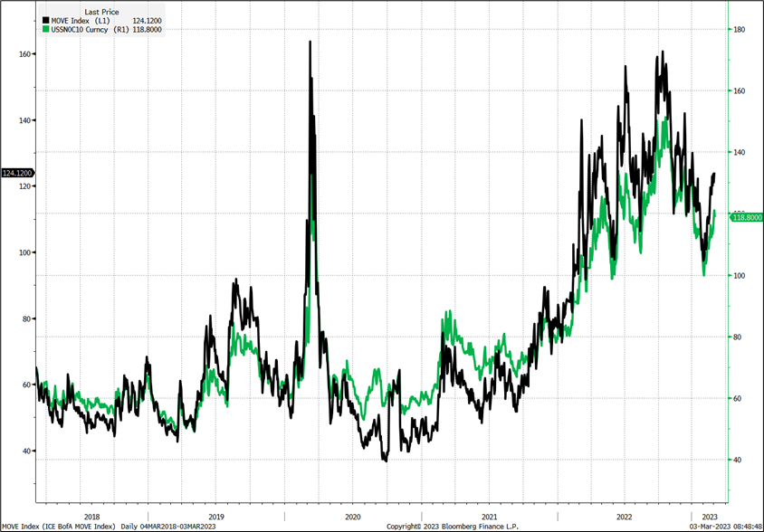
Thanks to everyone that responded to my question about a real-time MOVE Index. The crowdsourced answer is USSN0C10, which is 3-month implied yield on 10-year swaps. Here is the overlay of that thing with MOVE.
Daily chart of MOVE Index and USNN0C10
Final Thoughts 2
If you are open to new types of music, check out Xena by Skrillex. Rarely will you ever hear a Palestinian flautist and singer combine with a California dubstep master to create a better piece of jungle-inspired hardgroove techno! Features Nai Bharghouti on vocals. The drop at 2:00 and the way it escalates into madness around 3:18… So good.
Have a hard-pounding day.