A frequently asked question, answered.
Plus: It’s time to get mortgage resets back on the radar but safer to keep ignoring soft data and wait for the hard data to turn.

A frequently asked question, answered.
Plus: It’s time to get mortgage resets back on the radar but safer to keep ignoring soft data and wait for the hard data to turn.


A male grandala.
They live in Bhutan, India, Myanmar, Nepal and Tibet.
Long 2-month EURMXN
18.70/18.20 put spread
~50bps EUR
off 19.16 spot
October 23, 2023
Much has been made of the fact that the USD cannot rally, even as US yields shoot skyward. For example, you have probably seen charts like this going around:
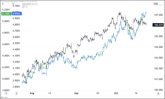
This is mildly interesting and could suggest that either:
a) The market is mega long USD and thus it can’t rally despite higher yields, or
b) Los vigilantes!
But only until you look at this chart:
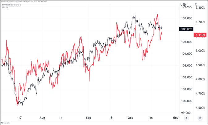
This raises a question I have been asked by clients and coworkers since at least 2006: Which part of the US yield curve matters most for the US dollar?
This is usually a moot question because the whole curve tends to move as a big monolithic blob. But it matters when there are aggressive steepening and flattening moves as we have seen lately. This question of what variables a currency pair listens to is interesting and complicated, especially when there is tons of cross-correlation between the variables and possibly other confounding variables lurking in the background.
The Book of Why by Judea Pearl (HT NSUV!) does an excellent job getting into these questions and one way the book suggests you can examine these relationships is to isolate the times when two correlated variables offer a conflicting signal and see what your variable does then. In this case, that would mean we look at days when 2-year yields go down and 30-year yields go up, and see what the dollar does. We should also look at the opposite condition to see if the effect is symmetrical and thus more statistically reliable.
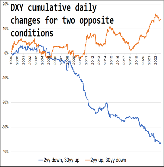
The chart above is what you get. You can see that a majority of the effect comes from the QE period 2008 to 2011 because QE was seen as both reflationary (higher long bond yields) and as forward guidance assuring no rate hikes (which put downward pressure on short-term yields). Not coincidentally, that blue line stops plummeting when the Fed started Operation Twist in September 2011. That policy action involved an effort to push longer-term yields down while propping short-term yields up. Still, even post-COVID, the data strongly implies that the dollar listens more closely to 2-year yields than to 30-year yields.
Therefore, the weakness in the dollar is less nefarious than it looks. US 2-year yields were 5.1% a month ago and they’re 5.1% now. The DXY was 106.10 a month ago and it’s 106.10 now. With the Fed almost certainly done hiking until at least January 2024 and probably done for this cycle, it’s getting less scary to be short dollars because even if the back end is unhinged, unanchored, and unruly… The dollar is more attuned to 2-year yields, and those yields are much more about Fed policy, not treasury supply or foreign demand.
The soft data in Canada and the tightening impact of skyrocketing long rates should keep the Bank of Canada on hold this week. There is no real reason for the central banks to signal they are done for the cycle as they can simply refer to any stoppage as a pause and maintain optionality in case inflation reaccelerates. There is very little priced in now for future meetings for the Bank of Canada, which makes sense.
The Business Outlook Survey and other soft data points to weakness ahead in Canada but the problem has been that the sentiment data has been kind of useless in this cycle as inflation has dulled sentiment while driving nominal growth higher and overall pessimism due to other non-economic factors like post-COVID mental health stress have driven a huge wedge between robust economic performance and gloomy future outlooks.
Still, Canadian mortgage rates have done this:
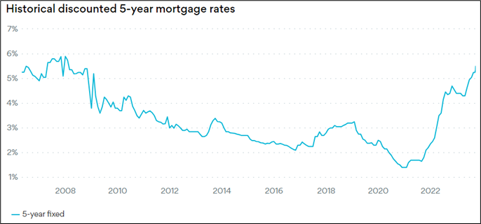
https://www.ratehub.ca/5-year-fixed-mortgage-rate-history
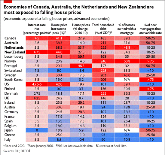
And it’s probably time to dust off all the housing vulnerability charts as we enter 2024. In Q1 of 2023, it was popular to discuss possible fragility in Canada, the UK, Australia, and Sweden (for example) as the assumption was that the tidal wave of mortgage resets would come onto the radar and the consumer would get slammed. This did not happen as most everyone underestimated the resilience of the global consumer. The US consumer was obviously strongest as he/she faces very little mortgage stress, but Canadians, Brits, and Aussies kept finding jobs and spending, too. And home prices didn’t fall much so that helped too.
With long yields going up every day, and time going tick tock tick tock as the fuse on the mortgage resets burns down, I figured I would have a look at some of the vulnerability data today because it’s not been circulated as much of late.
I find it hard to get raging bearish on the exposed economies given the timing appears so unknowable, but I think it’s good to have this stuff front of mind because the second the hard data turns in one of the countries, it will probably turn in all of them. As I have written many times in recent months, I’m skeptical of the soft data, though. I would rather wait to see weakness in the hard data (jobs, GDP, Retail Sales, etc.) before I get excited about the Big Mortgage Shock Trade of 2024.
Here are two more graphics.
https://www.eiu.com/n/global-housing-market-decline-will-slow-growth-worldwide/
And this one:
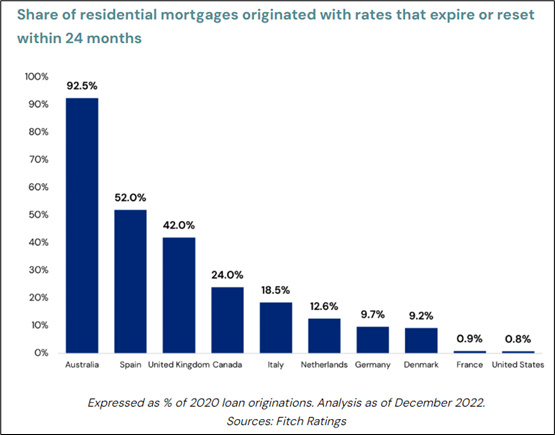
https://www.lasalle.com/research-and-insights/the-impact-of-residential-mortgage-resets/
Australia looks like the clearest risk if you eyeball those two charts, while Canada and New Zealand are in the mix, too. And the UK also looks pretty bad. Anyway, like I said, this is all just stuff for the radar. One day, consumers of the Commonwealth are going to have less money to spend and that’s going to matter. But attempting to front run that day has been costly. Waiting for the hard data to turn might make you late, but at this point a bit late might be better than very early.
Canada’s Retail Sales data is super lagged compared to the US, so we don’t get the September data until November 24. That’s more than a month later than the US data (the September release came out last week). If we compare the two countries by indexing total Retail Sales at 1 as of January 2022, we get this.
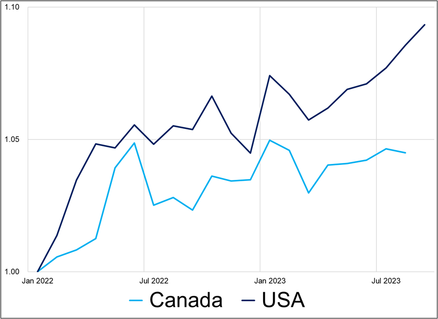
That chart doesn’t tell you too much yet, but I’m particularly interested in Canadian consumer behavior going forward as I would guess the specter of rising mortgage payments will first show up in hard spending data as Canucks retrench after receiving updates on their upcoming monthly mortgage payment increases in the mail. Jobs data and business confidence will probably react more slowly than consumers themselves. If and when the economic threat of mortgage resets is real, Canadian discretionary spending should reflect that pressure unequivocally.
Rarely have I been more excited about a baseball game than tonight’s game 7 with Scherzer on the mound for Texas. So many great storylines with two teams that despite one another. Go Rangers.
Have a remarkably colorful day.
https://twitter.com/gunsnrosesgirl3/status/1716034674277974039
Male grandalas are blue and females are gray-brown.