Rabbit Hole #4
The Magazine Cover Indicator
Welcome to Rabbit Hole #3. The Rabbit Hole series offers deep dives into random trading and macro topics that fascinate me. Today I look at the empirical evidence in support of The Magazine Cover Indicator. With Elon Musk gracing Time’s cover as the 2021 Person of the Year, it seems like a good time to revisit this topic.
Anecdotes can be excellent indicators (or worse than useless)
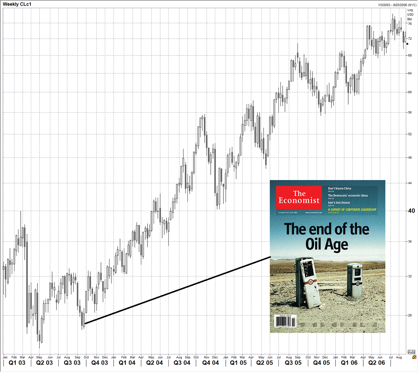
You will notice that market prognosticators and the financial media will often point to a particular piece of anecdotal evidence as bullish or bearish. Quite often, the evidence is intuitively appealing as a contrarian indicator. Examples include celebrities endorsing an asset class (like Gisele asking to get paid in euros in 2007), your artist uncle asking about day trading at the Thanksgiving dinner table, or magazine covers blaring a strong view on a particular asset (like this one):
Oil price, 2003 to 2006
An example of a contrarian cover story from The Economist
Anecdotes can be unreliable
The problem with anecdotes is that they are prone to sample size issues, confirmation bias, and cherry picking. If you’re always bearish stocks, for example, you will see anecdotal evidence of a top almost every day. If you think tech is a bubble, you will see anecdotal signs of overconfidence and tech hype all over the place. If you’re a crypto hater, you will find plenty of anecdotal reasons to get short crypto. Etc.
Some newsletter writers and commentators are infamous for finding daily anecdotal evidence that fits their priors, even as their (normally bearish equities) view continues to be wrong year after year.
Anecdotal evidence is also prone to apophenia, which is humans’ predisposition to see patterns everywhere. See pages 216 to 225 of Alpha Trader for more on apophenia. For example, take a look at this stock market analysis using the anecdotal evidence of “Major Events in the Beatles Career” vs. stock market performance:
Backward-looking application of anecdotal evidence yields highly fitted conclusions that are probably the result of apophenia and not useful for forecasting
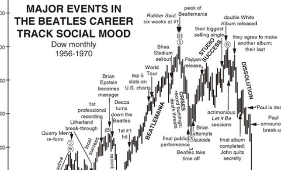
Source: https://twitter.com/RobertPrechter/status/1118524578651869190/photo/1
Anecdotes can also be useful
While trying to incorporate anecdotal evidence into your framework can lead to biased decision-making, it can also give you a simple and potentially reliable way of measuring social mood and identifying peak narrative in an asset class. If you ignore anecdotal evidence, you ignore a potential canary and you may miss obvious warning signs of trend exhaustion and peaks or troughs in the zeitgeist / hype cycle.
Finding an empirical framework
My belief is that anecdotal evidence is too important to dismiss and too unreliable and potentially biased to take at face value. So you need to develop a systematic way to track and back test anecdotal evidence to see whether or not it has predictive power. With the Magazine Cover Indicator, this is fairly easy to do.
The Magazine Cover Indicator is a belief commonly held by financial market participants that when a financial story or market theme is displayed on the cover of a magazine, that theme or the related trend is near exhaustion. In other words, magazine covers are believed to be reverse indicators.
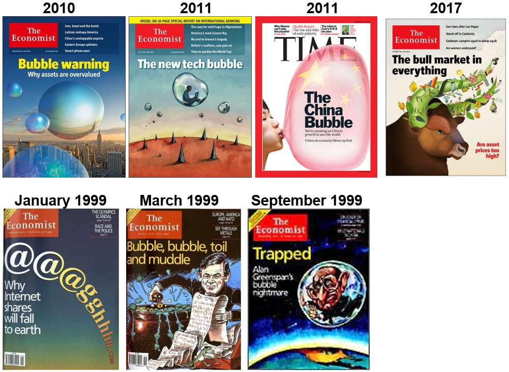
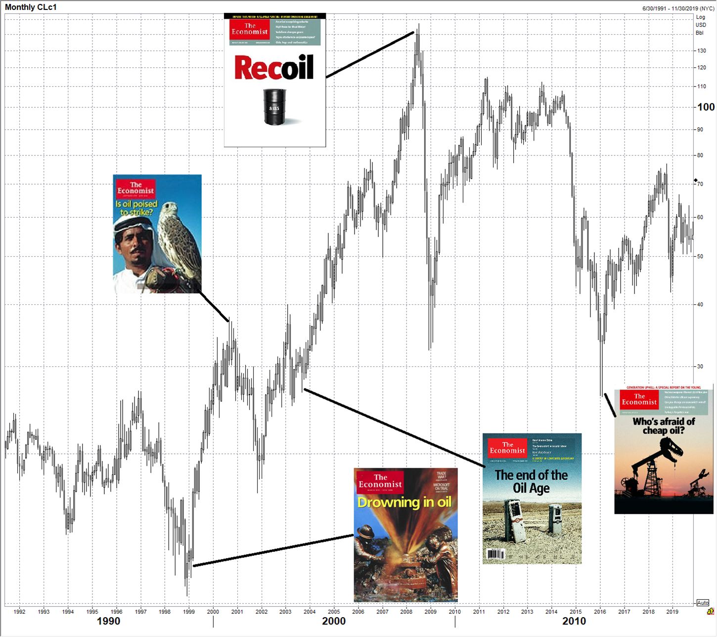
Two very famous examples are when BusinessWeek’s cover screamed: “The Death of Equities”, at the stock market lows in 1979 and when The Economist proclaimed the world to be: “Drowning in Oil” just as oil bottomed in 1999. Two other famous examples of the Magazine Cover Indicator are the appearance of Jeff Bezos as Time’s Man of the Year in 2000 just before the tech bubble burst and Russian President Vladimir Putin as Man of the Year in 2007, right before the collapse of oil brought down the Russian economy.
The premise behind the indicator is that when a journalist or editor finally devotes a cover to a market trend, company, country or person, the story or theme has been in vogue for some time and is likely past its peak. Positioning and sentiment should already fully reflect the story on the cover of the publication and the story should be priced in. In other words, by the time a journalist writes about a trend, a majority of the move has already happened. Also, there is mean reversion at work. Something has to move like crazy in order to make it onto a magazine cover, so by that point it’s almost surely overbought or oversold. Mean reversion is also what drives the Madden Curse, The Stadium Curse, and the Sports Illustrated Jinx. When something massively outperforms, it’s more likely to underperform in future due to simple mean reversion.
The problem with an unscientific indicator like this is that it becomes a part of market lore. Traders remember when it works and conveniently forget when it does not. Selection bias and cherry-picking are a problem. Then, every time a new magazine cover hits, people assume it is contrarian, even when there is no data to back this up—it’s just something people assume is true. It is easy to point to a cover story and draw conclusions, especially in hindsight. The purpose of this article is to investigate the following question…
Do the covers of Time Magazine and The Economist have contrarian forecasting value?
In 2016, Greg Marks and I did a study on the Magazine Indicator and found that it has robust predictive power. With Elon Musk winning Time’s Person of the Year award last week (and the subsequent Twitter pounding I took for daring to say something bearish about TSLA)… I thought it’s a good time to rerun the analysis with five more years of data.
Unfortunately, or maybe fortunately, I don’t have the spreadsheets Greg and I used in 2016, so I started from scratch. This is probably a good thing because it forces me to replicate the prior study and a similar result will confirm to me that there were no errors or bias in the study we did in 2016. Barron’s leans heavily bullish and has financial markets on its cover every week so it’s not a good contrarian indicator.
Before I get into the study, I want to share an observation from combing through all those weekly covers of Time and The Economist from 1997 to now.
There is nothing new under the sun
Look at these covers. They are all at least 10 years old and many are more than 20 years old.
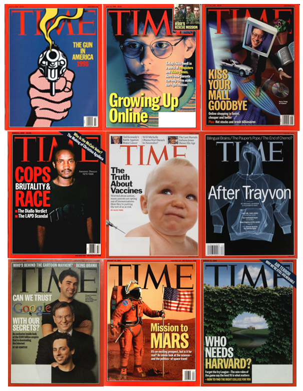
Notice we are talking about all the same issues right now. Gun violence, screen time, online shopping and the hollowing out of small business, police brutality, racial inequity, vaccine hesitancy, data privacy, going to Mars, and the growing irrelevance of elite education. All topics from 20 years ago that still resonate today. Interesting. I could have done way more, too. Climate change, America’s involvement in the Middle East, optimal diet, etc.
I encourage you to take a few minutes and have a gander. It’s a fascinating glimpse at recent history that offers a bit of perspective. The links for 1997 are here, you can click through, year by year.
Time 1997 covers
The Economist 1997 covers
Methodology
The choice of which covers to include or exclude is mildly subjective but the criteria I used are simple and objective. I think most people would end up with a very similar spreadsheet to mine if they did this task. The criteria for selecting a cover:
Cover selection criteria
- Does the cover clearly reference a market theme, country or asset class?
- Can an obvious contrarian trade be justified by this cover?
- Does the cover unequivocally make a statement on direction? In other words, does the cover have a strong bullish or bearish message and/or image? If a cover is ambiguous, exclude it.
- Time Magazine Person of the Year Edition only.
Back testing methodology
- Pick asset class most connected to the cover story. For countries, use that country’s stock market.
- Use Bloomberg data to see where asset is trading 1 month, 3 months, 6 months, 1 year, and 2 years later.
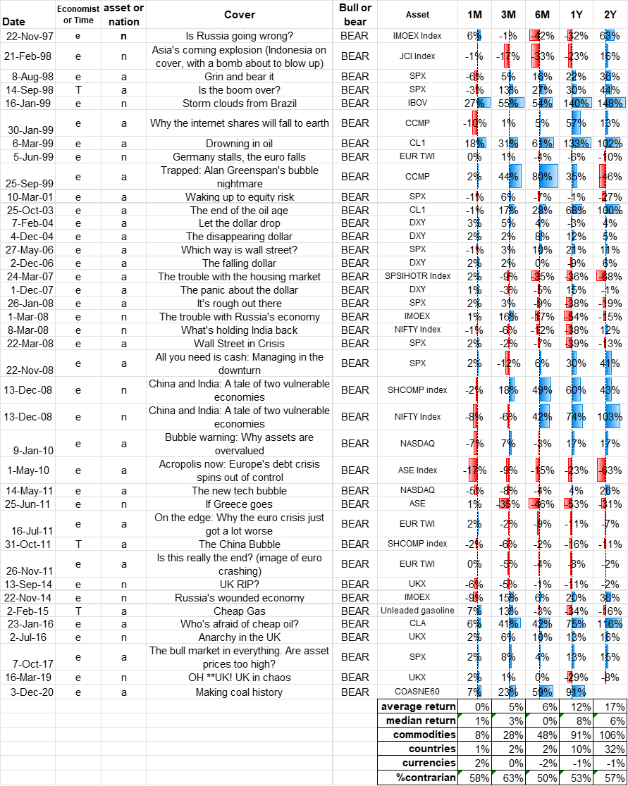
Again, the process of choosing the covers has a subjective component but I’m confident that different people choosing the covers might change the results at the margin but would not change the overall message or direction of the results. I included all the data as an Appendix so you can have a look. Let me know if you see any issues.
Results
The first thing I noticed is that The Economist covers are much more bearish than bullish. 39 negative covers and 23 positive. This is consistent with negativity bias in the media. Scary covers sell more magazines than happy covers. Sad but true. Time Magazine covers are more balanced and offer more caveats than covers of The Economist. Also, Time is not a finance magazine, so the overall sample was just 8 Time covers and 55 from The Economist. The overall sample is large enough that if you take out all the Time Magazine results, the output barely changes.
Here is asset price performance after a bullish or bearish magazine cover:
Bearish magazine cover (all)

Sample size 39 covers
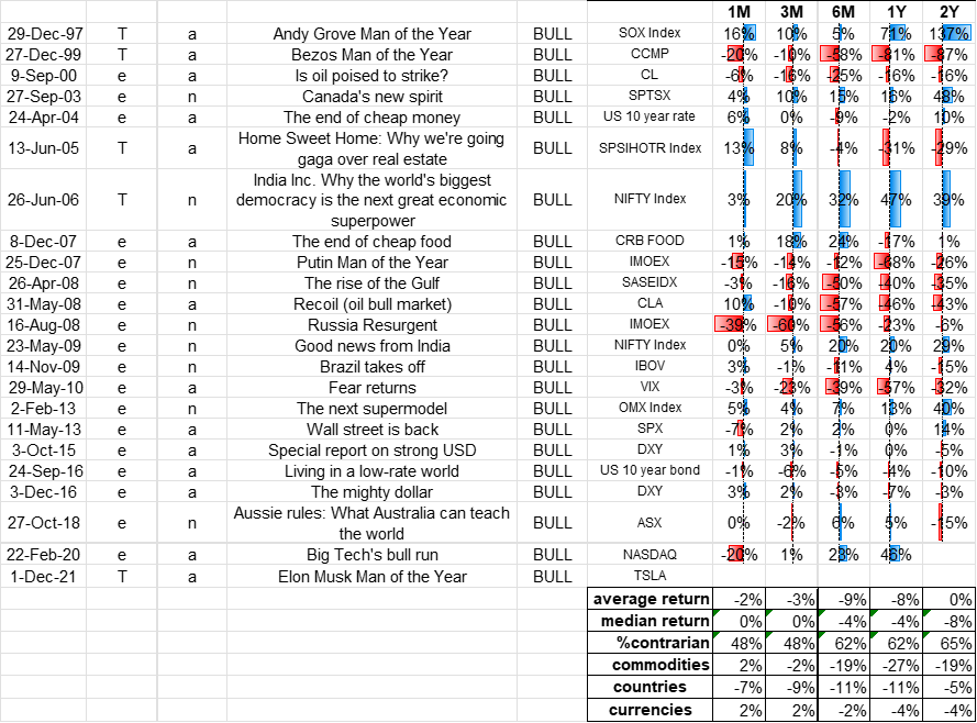
Bullish magazine cover (all)
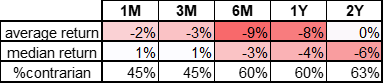
Sample size 23 covers
Takeaways
- First, and most important, my conclusion is the same one Greg Marks and I reached in 2016: Magazine covers are a good reverse indicator. The reversal starts pretty much right after the cover comes out (on average) and is strongest about a year later. The bearish covers are a stronger signal because most assets have been in a huge up trend since 1997. The fact that the bullish magazine covers yield meaningful bearish results is absolutely amazing in the context of the “bubble in everything” that has prevailed since 1997, when the Greenspan put was born. Most of the assets studied here have skyrocketed since 1997, so to find an indicator that yields meaningful bearish results is highly significant to me. I have done many, many of these types of studies, and the trend of the assets in question often dominates the output. Not here.
- Speaking of bubbles… How do you like these covers? Fear sells. Negativity bias is well known, and the media use fear porn to sell magazines. Scary stories sell magazines, even though (ironically) sophisticated traders see theses as bullish reverse indicators, not actual scary things[1].
- Currencies on the cover of The Economist are contrarian but not as much as I thought. Also note the asset moves in my study are not vol-adjusted. Currencies are less volatile than the other asset classes, so they barely move the needle.
- The Economist covers are shockingly bad on commodity direction. This could be a sample size issue or maybe it just takes an incredible amount of volatility and pain in commodities before they show up on the cover of the Economist. You can see this in the ludicrous contrarian returns in the tables on the previous page. The fact that the covers work in both directions adds to my strong belief this is definitely not random. On the next page, I present a brief visual history of The Economist’s oil-related covers.
Economist covers caught the major turns in oil from 1999 to 2016
Conclusion
Covers of The Economist and Time Magazine that point in a direction for a particular asset class are contrarian. They work as contrary indicators in both directions.
If you invest in the direction of a cover of The Economist, you should expect to lose roughly 10% of your investment in the year after it hits the newsstands.
Thanks for reading.
APPENDIX A: BEARISH COVERS
If this is too hard to read, and you want the spreadsheet, just email me
APPENDIX B: BULLISH COVERS
Returns are 1m, 3m, 6m, 1y and 2y
Notes
[1] Note, the covers in 1999 were eventually correct as the NASDAQ bubble peaked March 24, 2000. Anyone trading off the advice of the covers would have been bankrupt long before the crash, though. The NASDAQ doubled from September 1999 to March 2000, after all three of those covers came out.