The short-term Fed outlook is blurry even as the primary story is one of two options.
Malthus still hasn’t stopped out
The short-term Fed outlook is blurry even as the primary story is one of two options.

Malthus still hasn’t stopped out
Hello. It’s Friday. Thanks for signing up. I’m Brent Donnelly.
Here’s what you need to know about markets and macro this week

Before we get started, here’s some feedback we got yesterday about Spectra School.
I have just completed the course. I have found what you wrote in your concluding words massively true: I did learn a ton and found the structure, lessons and content enjoyable. I’m glad I found little overlap with your books (from which I had learned a lot, too). And I want to stress: you are presenting practical information and knowledge in a highly captivating and enjoyable style. The course was fun, even exciting to take! Thank you! And looking forward to continuing to learn from you whether from your newsletters, or otherwise on my journey to finance/trading!
Tamas N.
Check out the video about Spectra School right here.
Let’s go!
This was supposed to be the week where we get clarity as NFP, Williams, and Waller were going to tee up either 25bps or 50bps for the September FOMC meeting. Instead, we’re in the Fed Blackout Period, and we still don’t really know if it’s 25 or 50. Tricky. Pricing leans toward 25bps now, but it’s blurry.
There are good arguments for cutting 50:
There are good arguments for cutting 25:
For a full discussion of the 25 vs. 50 story, please check out my fresh new podcast with Alfonso Peccatiello.
So, the short-term Fed outlook is blurry even as the primary story is one of two options:
Choose your own adventure.
Stocks are choosing violence over the past 6 weeks as textbook bearish seasonality kicks in, the AI narrative sputters, crypto sags, and the economy may or may not be mid-dirtnap.
It’s week 36 of the year and we are now in a bad period for equities as average returns for weeks 36, 38, 39, 40 and 41 are all negative as you can see in the next chart. Only 21 out of 52 weeks of the year exhibit negative average returns, so to see five of them clustered into a six-week period is worthy of a bit of a fear factor. I am using data from 2000 to now for this weekly performance analysis.
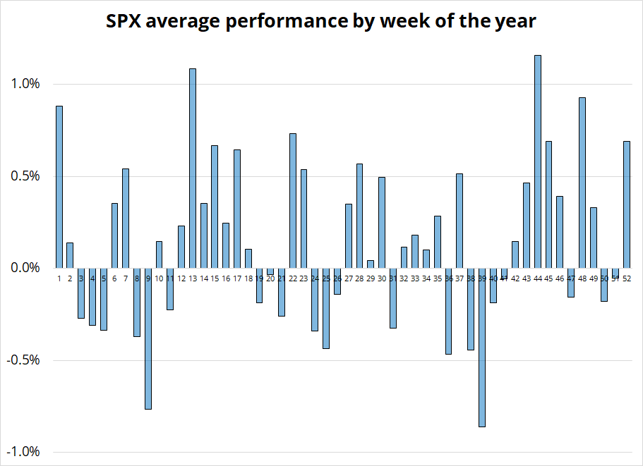
Obviously, this is a bit late for anyone caught long, but I did put this in my Tuesday piece, so if you subscribe to am/FX you already knew this! Seasonality is often amazing as it is well known but continues to work out of sample, year after year.
With regard to anecdotal evidence of an AI mania… In case the signing of the boob wasn’t enough, now we get this:

You can do all the earnings and fundamental analysis you like, but sometimes all that matters is stuff like this. In Lesson 3 of Spectra School, we go through the clear narrative path that stories like AI and NVDA tend to follow. In that lesson, there is also a 40-minute Learning from Legends video with Ben Hunt (and me!) where Ben explains that many traders and market analysts trying to understand why stocks go up and down never get past the first derivative. If you want to get to the 2nd, 3rd, and 4th derivative of how markets work, you need Spectra School.
While NVDA has been flying too close to the sun for three months, it’s still a two-bagger on the year. This next chart shows how critical the $100 has been in both directions. In the August crashy thing, we got well below on an intraday basis, and we dipped to $98.50 after the recovery, but generally you can see that $100 was huge resistance in Q1/Q2 and huge support in Q3.
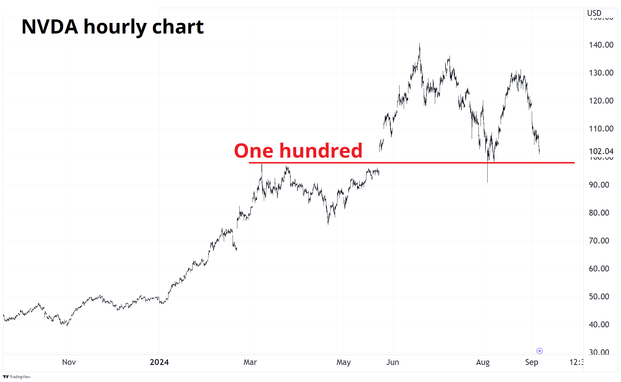
A daily close or two below $100 should confirm that Icarus’ beeswax has melted.
Here is this week’s 14-word stock market summary:
Stock markets are under pressure. Doo doo doo dee dee doo doo. Under pressure.
The market really, really wants the recession trade and wanted a weak NFP and 50bps in September and it’s getting the desired move in bonds even if the fundamental evidence doesn’t all quite stack up just yet.
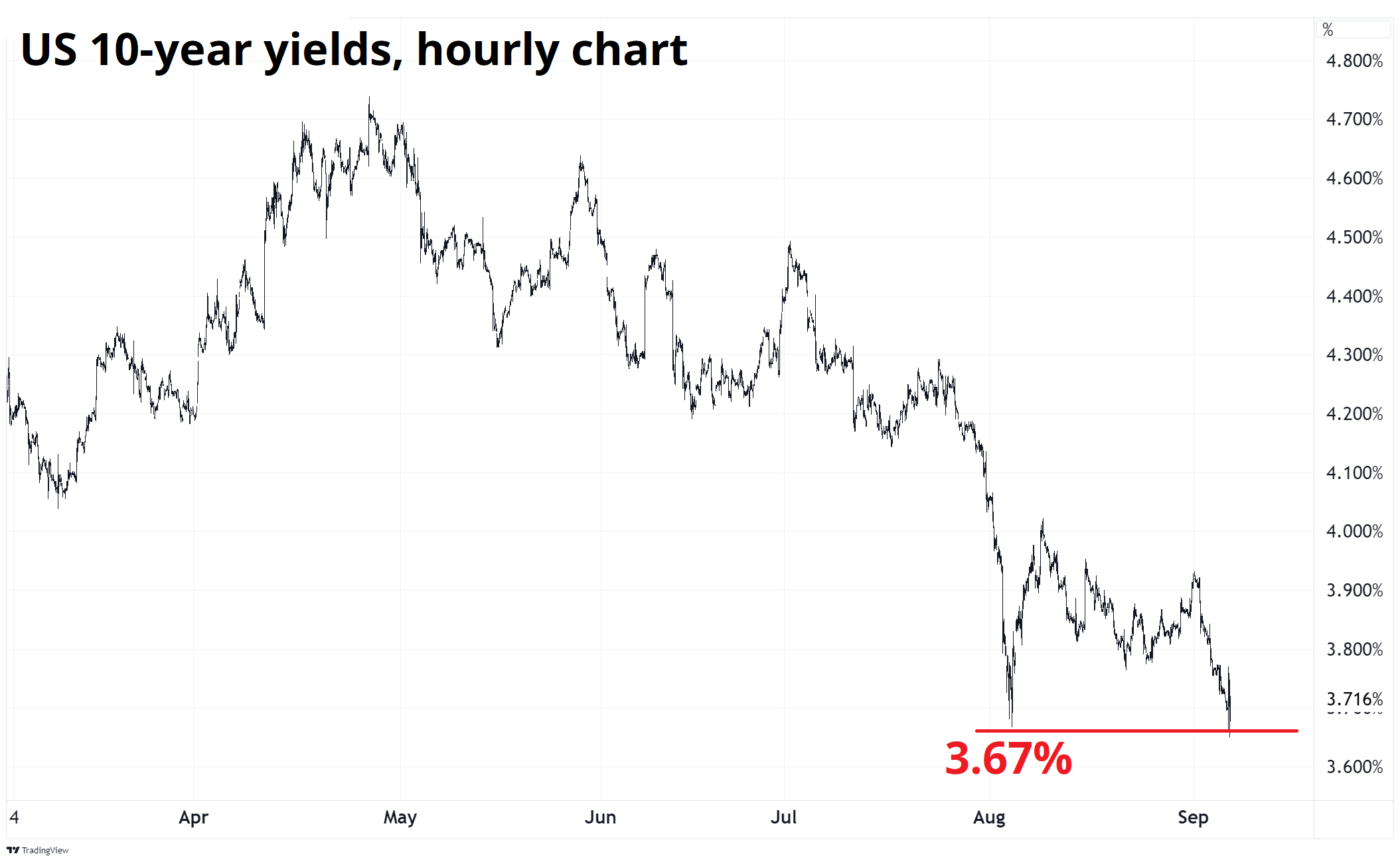
10-year yields made a 3.67% low when the VIX was blowing up in early August, and now VIX is at the elevated, but not scary level of 23.5. Yet yields are tickling the same 3.67% zone. Does the economic data justify it? Maybe not just the US data in isolation, but with Europe and China still mostly sucking wind and commodities smelting lower, global inflation is set to go down and therefore yes, it’s pretty easy to justify lower yields.
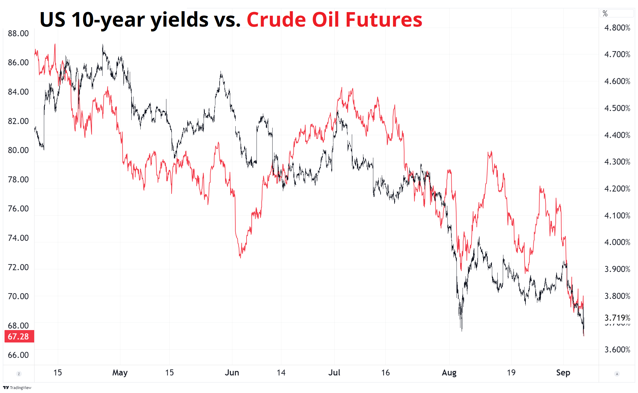
Oil prices flow directly through to headline inflation around the world and therefore you often/usually see a strong positive correlation between oil and bond yields. Lower oil = lower inflation = lower yields. Here’s the hourly chart evidence:
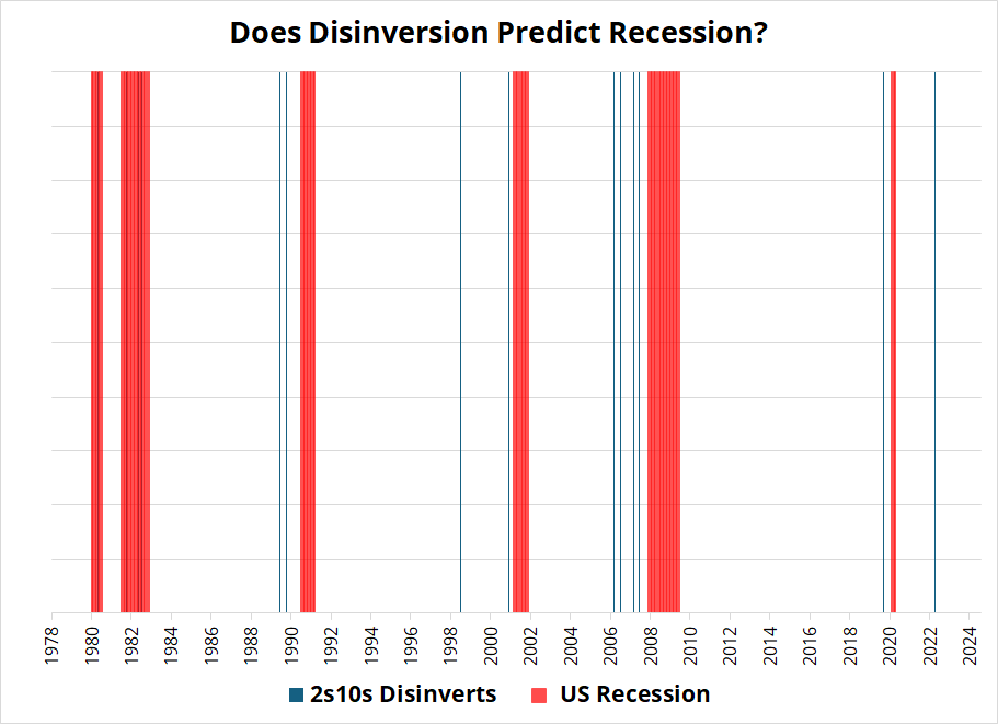
Meanwhile, the US curve is disinverting as 2s/10s now trades slightly above zero. While the yield curve is a useless recession indicator for people who are trying to make money, there are some that argue disinversion is the real deal. The chart is below. It shows months where 2s10s disinverted in blue, along with US recessions in red. I will let you judge for yourself.
Trading currencies is notoriously difficult, and these last few weeks have been no exception as we have seen some eye-watering moves in CAD and NZD (for example) despite dovish central banks in those countries and a spicy selloff in other risky assets. While some of this reversed today (USDCAD up 80 pips, for example)… There is still a fair bit of head scratching around pairs like AUDNZD (lower) and even the big USD (mixed).
The market had been noodling and trading a short dollars hypothesis for a few weeks in August, but the whole story looks a bit flimsy to me as US rate cuts into recession are not all that bearish for the USD, historically, and a rebound in US activity and a higher-for-longer Fed would not be bearish either.
Normally, sustained USD selloffs happen when the rest of the world (RoW) is doing OK to very well and there are multitudinous destinations for global capital. Right now, VW is shutting down plants in Germany, China is in a full-on balance sheet recession, Brazil is uninvestable according to the richest man in the USA, Mexico is hemorrhaging judges, and the US looks like one of the cleaner dirty shirts, still.
Editor’s note: Hemorrhaging (US) or Haemorrhaging (UK) is such a glorious and hardcore horrible word! From Latin haemorrhagia, from Ancient Greek (haimorrhagía, “a violent bleeding”), from (haimorrhagḗs, “bleeding violently”), from (haîma, “blood”) + -ραγία (-ragía), from (rhēgnúnai, “to break, burst”).
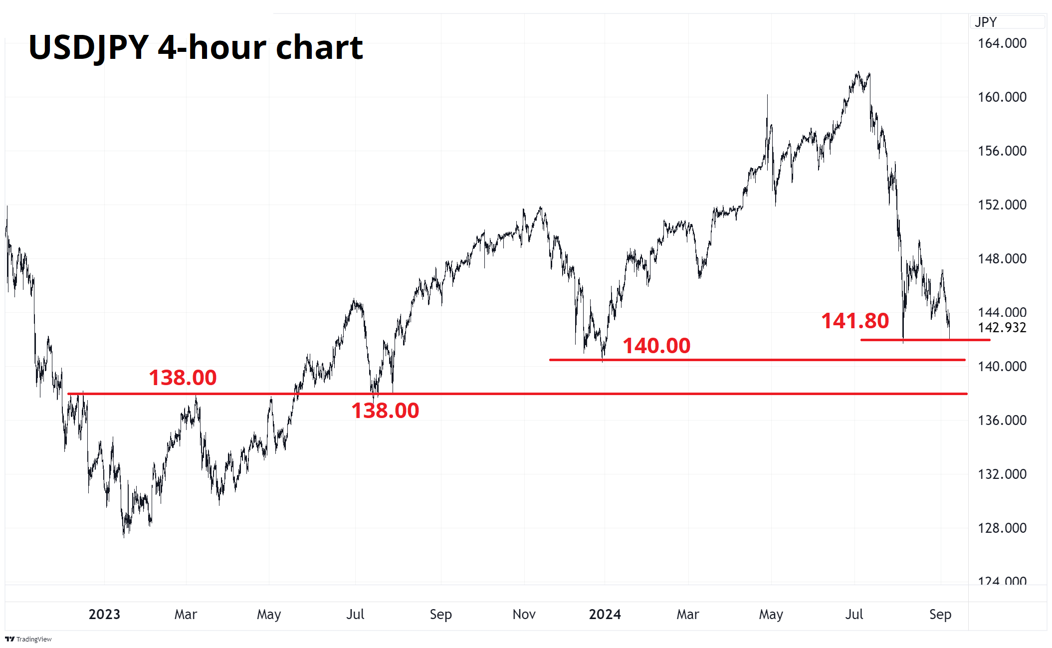
Anyhoo! The main narrative in FX land has surrounded the JPY as it remains the ultimate Veblen good. Everyone wants to buy it when the price is high, and everyone wants to sell it when the price is low. There are some huge chart points coming up.
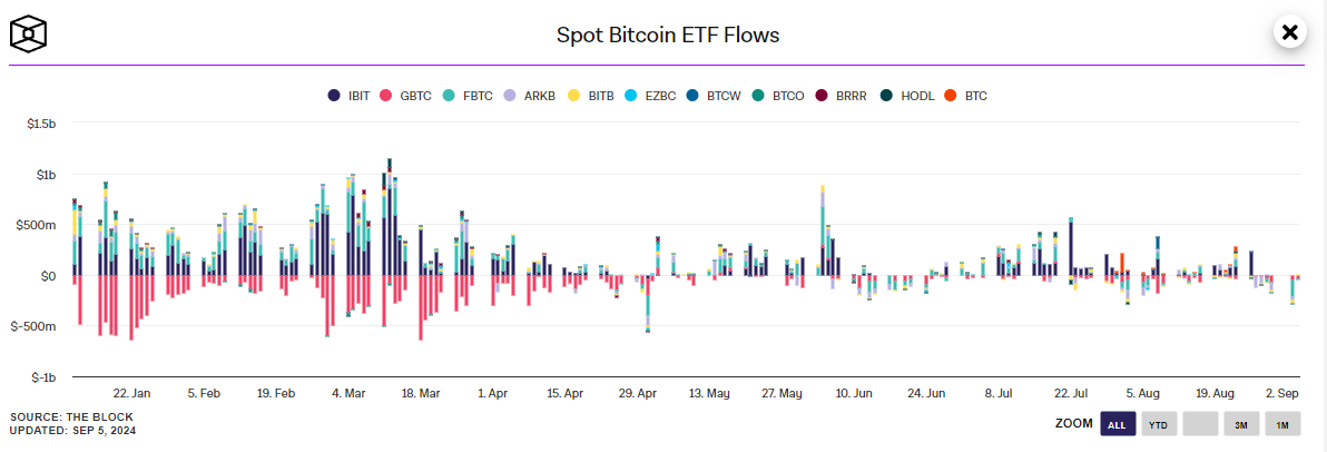
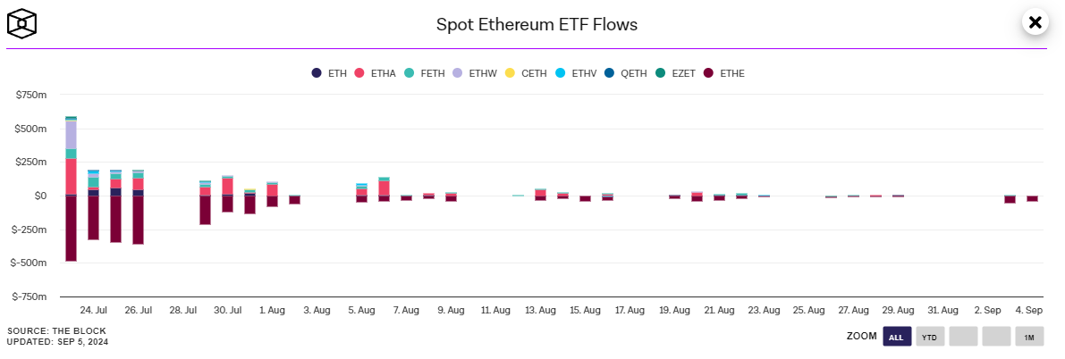
I maintain my view (discussed in last Friday Speedrun) that crypto is dead money for a while as there is no narrative to speak of. When supply is essentially fixed (as it is for BTC), then all you need to think about is demand. And demand for crypto is determined by just one thing: Attention. When people are excited about a crypto narrative, they pay attention and NGU or NGD. Right now, there is no big narrative either way, so might as well earn 4% in T-bills and wait for a good story to appear. It might be a while.
Here are some of the factors working against crypto for now:
Yuck! Commodities are doing what commodities do and heading south for the winter. An interesting feature of commodities (unlike USDJPY) is that sentiment does not react much to price. People are almost always some level of bullish, all the time. If commodities are going up, it’s the beginning of a new supercycle and if they are going down it’s a chance to buy cheaper.
Hmmmm.
This is odd and interesting in the face of 20 years of evidence showing that commodities are a horrible place to put your money, generally. Think about the magic of compounding, and how much $1 placed at random in any normal asset class 20 years ago would be worth, say $3, $4 or even maybe $6 while $1 placed in commodities 20 years ago would be worth ummm… 99 cents.
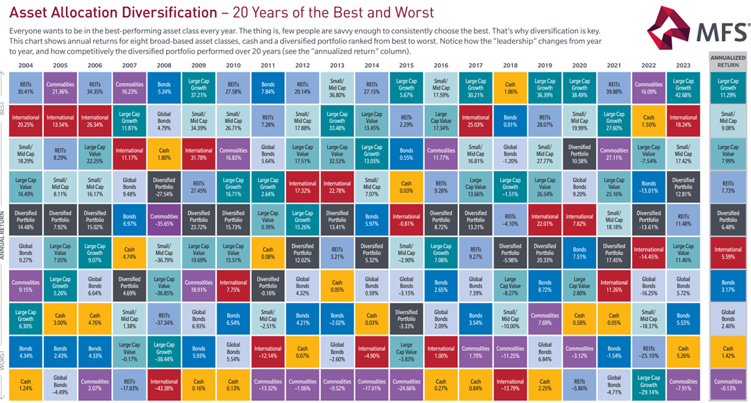
Extrapolation is a horrible way to forecast, but in the case of commodities, Malthus has been wrong since 1798! The Simon-Ehrlich Wager happened in 1980! That’s a trend!
Whew! OK! That was 9 minutes. Thanks for reading Friday Speedrun.
Get rich or have fun trying.
Smart, interesting, or funny
A super thorough walkthrough of how valuation works and how stock prices move around earnings.
Curious George and the case of the unconscious culture
Easily the best thing I read this week.
And finally … When you are talking about me at a bar, be careful. I have eyes and ears everywhere.
Including Espirito Santo Bar in Sao Paulo, Brazil.
Here is an audio clip someone shared with me.
To clarify… I’m not a Boomer, Daphne. I’m GenX. Also known as: The coolest generation.

Thanks for reading the Friday Speedrun! Sign up for free to receive our global macro wrap-up every week.